Culminating months of color of the year picks from paint, wallpaper and other home design companies, Pantone has weighed in with its choice for 2023: Viva Magenta (18-1750).
The “pulsating” and “animated” red “vibrates with vim and vigor,” says the color standards company, which has headquarters in Carlstadt, New Jersey.

“In this age of technology, we look to draw inspiration from nature and what is real. Pantone 18-1750 Viva Magenta descends from the red family and is inspired by the red of cochineal, one of the most precious dyes belonging to the natural dye family, as well as one of the strongest and brightest the world has known,” said Leatrice Eiseman, executive director of the Pantone Color Institute.
The “powerful and empowering” red conveys “pure joy, encouraging experimentation and self-expression without restraint,” the company explained.
It’s a bit bolder than shades picked by some paint and wallpaper companies in the fall. Those colors of the year also invoke optimism, but also a cozy, comfortable feeling for home environments.
Viva Magenta was reportedly selected by Pantone’s color prognosticators and then interpreted by an artificial intelligence tool called Midjourney, and in announcing Viva Magenta, Pantone welcomed its audience to the “Magentaverse.”
The AI-infusion into the process prompted some strong feelings about the color when The New York Times asked members of its Style team to weigh in.
“The AI part of it feels like a gimmick gone wrong,” Stella Bugbee told her newspaper. “Our ability to think about and differentiate between colors and apply meaning to them feels like a big part of what makes us human. Why outsource that?”
The NYT’s Callie Holtermann had a similar take: “Like those Dall-E images created by AI, it’s got the gist, but something is off in a way that a robot might not (yet) notice, but a human would.”
Jeremy Allen was more forgiving: “As a designer of the print section on this desk, I have no doubt my job will be replaced by an algorithm in, what, five years? … But the lo-fi-ness of it all is one of the reasons I love magenta: It’s not so secretly one of the cornerstones of color printing — the M in CMYK (cyan, magenta, yellow, black). When something looks too red on a proof, we ask to reduce magenta, not, in fact, red. It’s a subtractive primary color, which means it never really gets its due. But what would we do without it?”
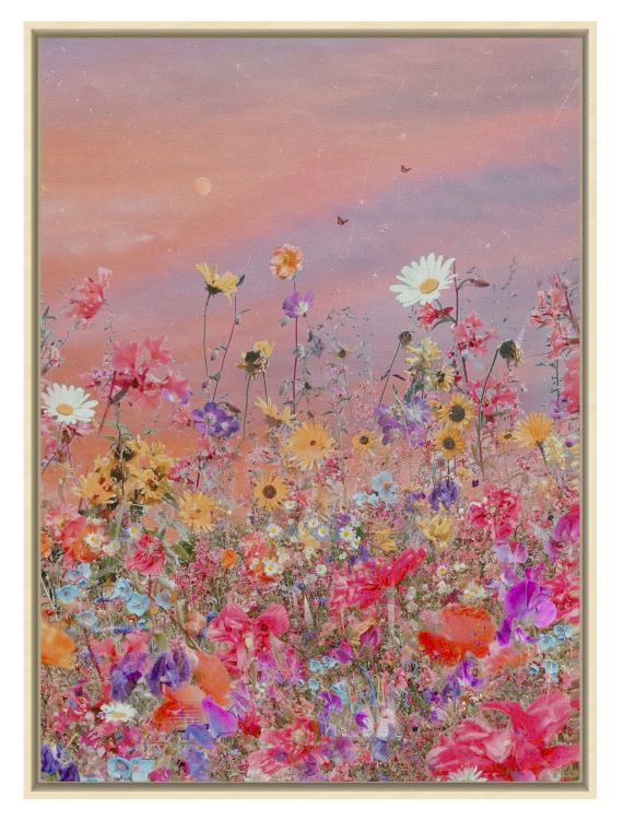
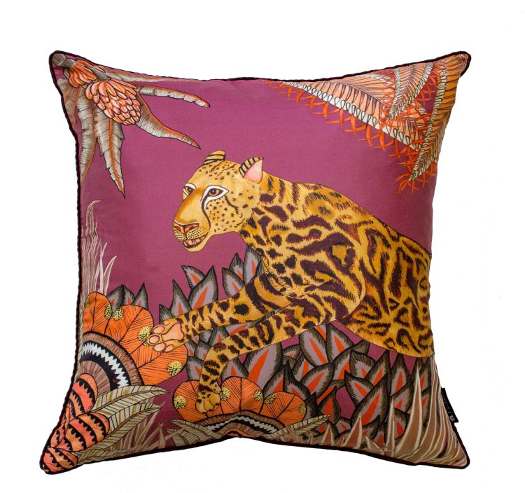
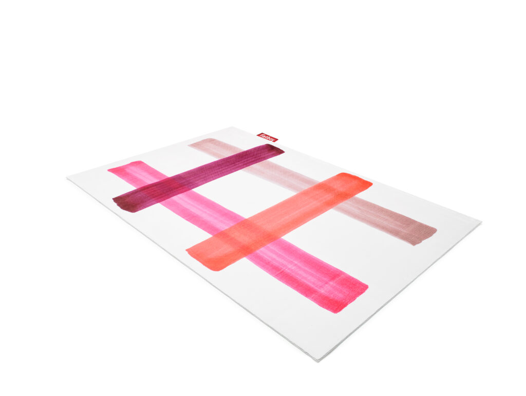
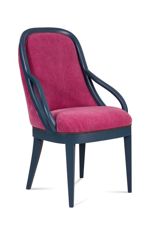
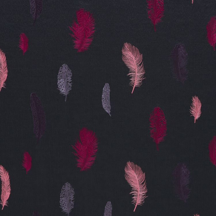
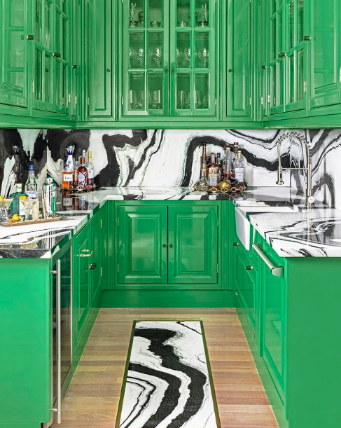
We don’t want Viva Magenta to live alone in the Magentaverse. Here are some home furnishings products that could live comfortably in its neighborhood.
