
Color forecast: Optimistic, sizzling, versatile hues ahead
Urgent Orange. Puddle. Suncloud. Those are a few of the hues that trend forecasting firm FS expects to find their way into home furnishings, apparel and other consumer goods.
Fall is the time when many paint companies, wallpaper purveyors and design forecasters unveil their top color picks for the coming year, but FS takes a longer-term approach, looking two years ahead for its fall/winter and spring/summer color forecasts.
The New York-based firm recently unveiled its outlook for fall/winter 2025-2026, focusing on three key color palettes: Savory Brights, Practical Neutrals and Artisanal Midtones. (The full color forecast, available to FS clients, also includes Decadent Darks, featuring the rich brown Ganache, and Superimposed Pastels, anchored by a hue called Blue Star.)
FS’s color forecasts are based on quantitative and qualitative research from its trend experts around the globe, who consider macro trends, cultural sentiment and emerging innovations, among other factors.
In announcing its latest forecast, FS noted that it carries over some colors from previous seasons, a nod to the idea that brands don’t need to reinvent their entire color palettes each season.
“Trans-seasonal colors signal the continued conversations around sustainable color selections, and how implementing more carryover or across-season colors can minimize your palettes,” FS’s Hallie Spradlin said. Carryovers “really exemplifies a departure from this constant pursuit of newness and encourages a profound appreciation for hues and their longevity,” added FS’s Jo Thomas.
Here’s a detailed look at the three forecasted color palettes:
Savory Brights
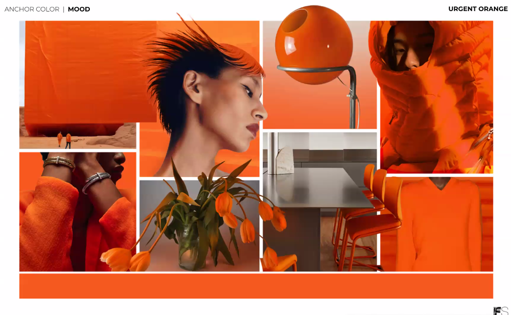
FS describes the Savory Brights as “sizzling, fiery, evocative hues.” “It’s a symphony of colors that tantalize the eyes as they stir the imagination,” Spradlin said. “Just as a skilled chef carefully selects and combines ingredients to achieve the perfect taste, these colors are expertly curated to evoke powerful emotions and visual delight.” The palette includes Jupiter, a berry shade carried over from FS’s spring/summer 2025-2026 forecast, as well as the brights Chili Oil and Lime Zest. Soy Sauce and Steel provide cooling relief from the heat of the bolder shades.
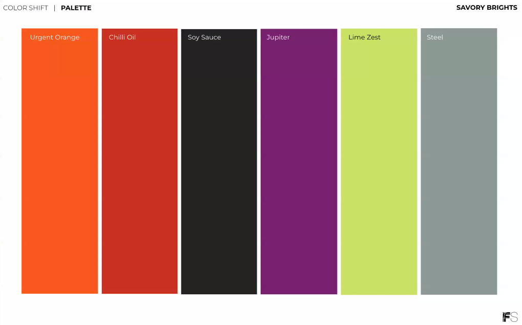
For each palette, FS selects an “anchor color,” and for Savory Brights, it’s Urgent Orange, a standout hue among standout hues.
To balance it, FS showed Urgent Orange paired with Soy Sauce, a brown-infused black, and the pale neutral Milk Frost. Other nice pairings for Urgent Orange are green hues, from the super bright Lime Zest to soothing Natural Teal, as well as pale blues and light browns.
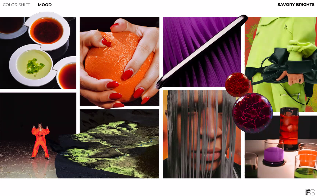
In practical applications, FS sees the Savory Brights complementing “a wide range of sensory experiences, from a tactile PVC to brushed aluminum,” Spradlin said. “Textures like rippled surfaces, melted forms and transparent layers inspire innovative rubber outsoles for footwear and cast resins for decor or accessories.”
Practical Neutrals
The Practical Neutrals “are driven by a sense of stability, reliability and durability,” Spradlin said. “In an era where consumers prioritize investment pieces, streamlined essentials and sustainably crafted products, these hues have a profound resonance.”
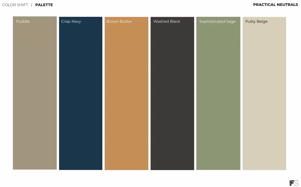
Two colors in the palette — Washed Black and Puddle — are carryovers from FS’s spring/summer 2025-2026 forecast. They are joined by Crisp Navy, Brown Butter, Sophisticated Sage and Putty Beige.
The sophisticated Practical Neutrals “embody the concept of meaningful minimalism that our team has been discussing and researching this season, which involves harmoniously uniting purpose and aesthetics, presenting a transformative perspective on timeless colors and subtle elegance,” Spradlin said.
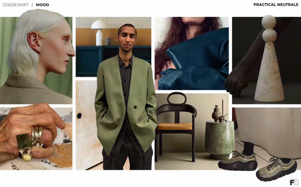
FS said these colors lend themselves to materials such as whitewashed woods, organic cottons, vegetable and traditional leathers, and brushed metals. The hues also fit well with environmentally friendly production processes.
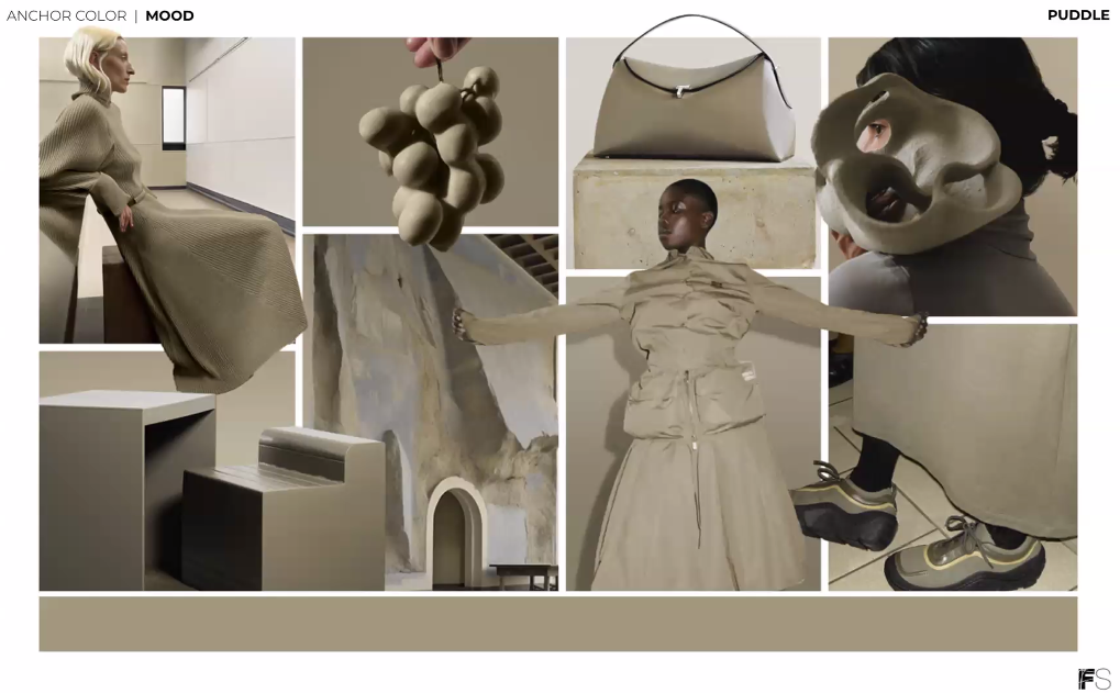
The anchor color for the palette is Puddle, “a hue that really embodies stability and timeless versatility,” Thomas said.
FS showed Puddle, which spans the realms of gray and beige, with contrasting greens and blues, including a pastel purple-blue called Smoothie, Lime Zest from its Savory Brights palette and soothing Sophisticated Sage.
Playing on its versatility, Puddle also fits seamlessly into a palette with other neutrals, including Brown Butter, Putty Beige and a rust hue called Blazed Brown.
Combining Puddle with vibrant greens and blues like Cool Mint and Mineral Blue and deep, rich hues like Ganache creates “a subtle yet powerful and understated aesthetic,” Thomas said. “… It’s a subtle play of hues that brings a sense of tranquility and freshness, making it an ideal choice for those that are seeking understated yet really impactful design.”
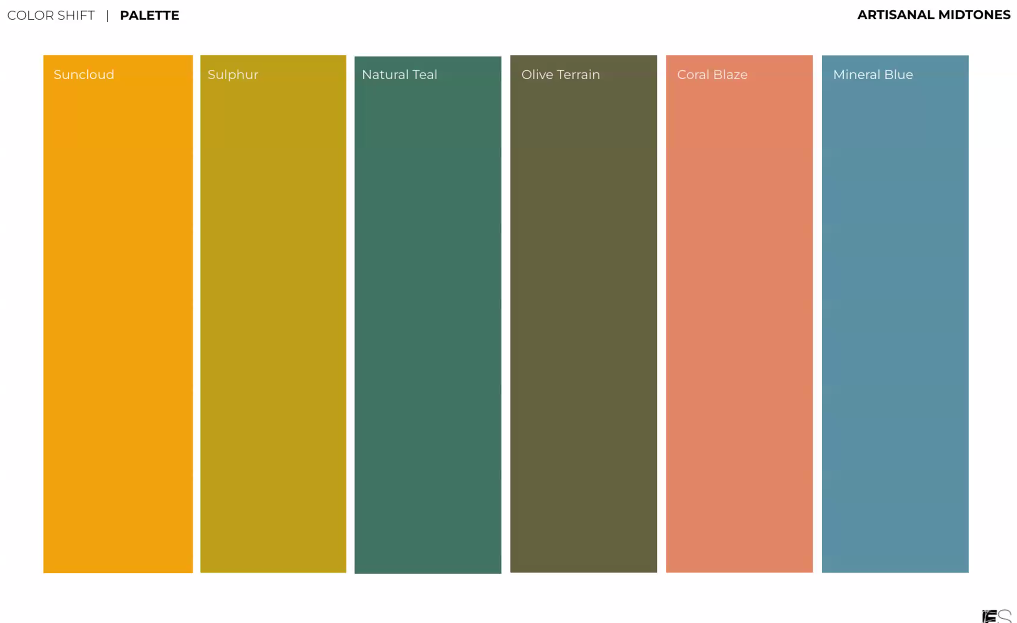
Artisanal Midtones
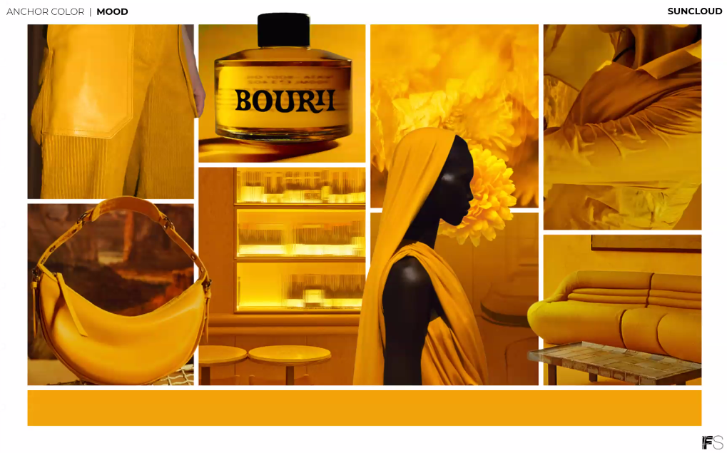
The optimistic Artisanal Midtones “emerge from nature, offering a refreshing departure from the conventional earthy tones, while still carrying that weathered, gritty edge that pays homage to earth-positive practices and natural pigments,” Spradlin said.
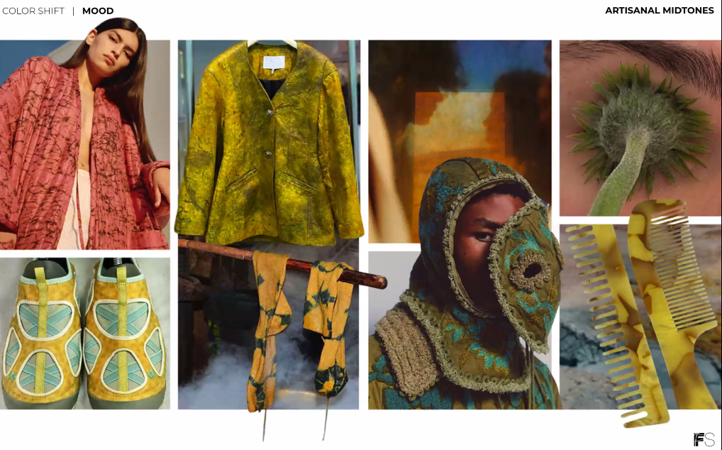
The palette includes beachy, watery hues like Mineral Blue and Natural Teal; the warm, sun-kissed Coral Blaze; and earthy shades like Olive Terrain and Sulphur (a carryover color from spring/summer 2025-2026).
“Together, these colors create a shift that is both grounded and full of life, celebrating the beauty of nature’s diverse color offerings,” Spradlin said. “The colors also continue to speak to that sentiment of cross-seasonal colors. I believe these will transition so beautifully into the spring summer season, as well.”
Material applications for the Artisanal Midtones include artisan-made clays and textiles, washed finishes, botanical pigments, and pairings of grasses and natural materials.
Golden Suncloud — “with an organic, uplifting and hopeful quality” — anchors this palette, Thomas said.
When paired with faded, worn, earthy hues like Olive Terrian, Steel, Mineral Blue and a pale Scuffed Lemon, Suncloud shines.
FS also showed Suncloud along with rich Chili Oil and Blazed Brown and balanced it with Coral Blaze for a warm, inviting palette reminiscent of traditional prints and weaves. Combining Suncloud with the deep red Crushed Cherry, pale Blue Star and fudgy Ganache lends a similar effect. “This approach not only brings a sense of timeless elegance to your designs, (it will) also resonate with consumers who appreciate the beauty of natural materials and traditional craftsmanship,” Thomas said.
For “high energy and visually striking impact,” FS paired Suncloud with two contrasting blues: Mineral Blue and Crisp Navy.
For more
In addition to color forecasting, FS assists clients with developing color identities and color strategies, using its consumer insights as a foundation. It also offers color workshops and customized trend presentations.
