
FS forecasts key color trends for 2025
Earthy, tactile midtones. Effervescent pastels. Brights that will energize and even unsettle us. Those are among the color trends FS is anticipating for everything from home furnishings to fashion for spring/summer 2025.
The New York-based global trend forecasting and consumer insights firm laid out its forecast during a recent seminar, part of FS’s Color Week.
The five color palettes, or color shifts as FS calls them, for spring/summer 2025 are Enlivened Midtones, anchored by the color Terracotta; Jelly Pastels, anchored by Bouncy Mint; Unsettling Brights, anchored by Glazed Cherry; Unfiltered Neutrals, anchored by Scuffed Lemon; and Somber Shades, anchored by Washed Black. FS dove deeply into the first three palettes during the seminar. (Full forecasts and custom forecasts are available to FS clients.)
Enlivened Midtones

The Enlivened Midtones include Wild Poppy, Burnt Ochre, Open Water, Dusted Clay and Artichoke.
Hallie Spradlin, director of visionary for FS, describes these hues as “beguiling, distinctly familiar and still yet like nothing you’ve ever seen before.”
“These earthy pigments signal consumers’ desire to welcome objects that are steeped in history and storytelling, resulting in a treasure trove of (pieces) with a time-worn narrative,” Spradlin says. These tactile tones have emerged from organic materials. Think everyday objects, imperfections and oxidation but also luxuriousness and decadence.
Each Enlivened Midtone is “powerfully rich” on its own; together they are “indulgently ignited,” she says.
In application, these colors work as reinvented finishes and materials: supple leathers, faded stoneware, natural fibers like hemp and linen, but also powder-coated metals — the kinds of materials that endure, evolve and get even better over time.
Terracotta — a balanced bright with an earthy edge — is FS’s anchor color for the Enlivened Midtones palette.
Jo Thomas, director of color for FS, describes Terracotta as “a vitamin-infused, nurturing coral that encapsulates the benefits of sunlight and feelings of gratitude.” It draws on the elements of clay and the energy of the sun, and it will appeal to consumers interested in handcrafted items, sustainability and natural environments. For the home, Terracotta can serve as a new neutral.
Jelly Pastels
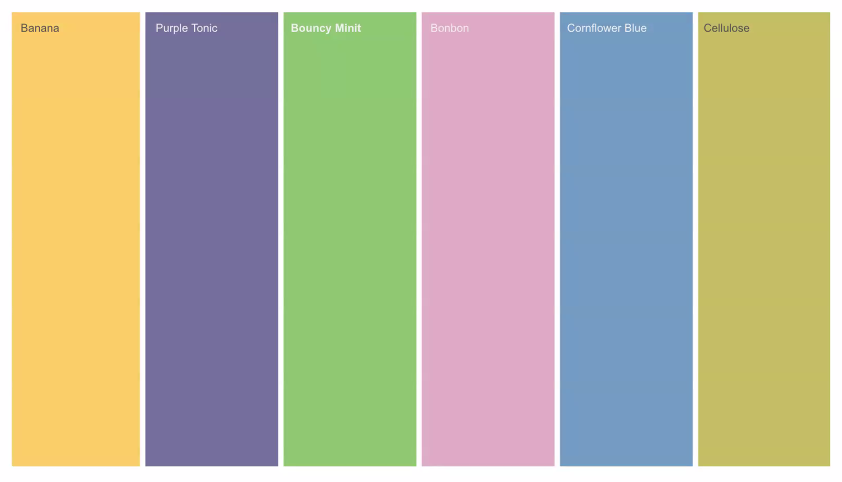
The Jelly Pastels palette, which includes Banana, Purple Tonic, Bonbon (a pink hue), Cornflower Blue and Cellulose (a sour green), emerges from the wellness movement and people’s increasing desire to care for themselves and their communities, Spradlin says. These hues evoke tranquility and empathy but are also infused with playfulness, vibrancy and joy to create a sense of hope and optimism.
“I feel like these take the term eye candy to a whole new level,” Spradlin says.
Together or separately, the Jelly Pastels add lightness to a serious world and encourage meditative, mindful moments.
Applications include everything from soft silicones and velvets to polished chromes and matte coatings.
The anchor color for the Jelly Pastels is Bouncy Mint (which Thomas showcased in a boatneck top she wore during the Zoom seminar). She describes it as “an activated pastel that exudes serenity, holistic well-being and digital optimism.” In Bouncy Mint, our virtual worlds collide with our physical ones.
For home, Bouncy Mint can bring a fresh energy to soft goods and upholstery or be used to add a subtle sheen to bio-based accents. Subdue Bouncy Mint by pairing it with FS’s Enlivened Midtones or Somber Shades. Or heighten its effervescence by combining it with cool blues or reflective silvers, Thomas suggests.
Unsettling Brights

The acidic, amped-up hues in the Unsettling Brights palette include Synth (a bright teal), Sulphur (a sour green-gold), Blazed Brown, Jupiter (a deep purple) and Envy (a rich green).
“Inspired by consumers’ growing interest into pushing the boundaries of societal constraints, these stimulating, saturated colors are anything but subtle,” Spradlin says, adding that the Unsettling Brights meld “natural and synthetic realities together” for “super-charged” shades that capture the duality of modern life.
These powerful, potent hues create an almost otherworldly feel. They both draw from and evoke the colors often seen during extreme weather.
Look for Unsettling Brights in 3D printing applications, blown glass, recycled plastics and engineered textiles. With their transcendence, they also work at the extremes — from high-gloss and lacquered surfaces to super matte metals.
The Unsettling Brights are anchored by Glazed Cherry, “a wonderfully complex hue that can morph between virtual and physical worlds and also positive and negative emotions,” Thomas says. Glazed Cherry is a highly evocative shade, rising from consumers’ interest in the horror genre in film, television and video games and in people’s desire to reclaim and proclaim their sexuality, she adds.
Pair Glazed Cherry with Washed Black (FS’s anchor color for its Somber Shades palette) for a powerful combination or ignite it by using it with colors like Bonbon, Terracotta and Blazed Brown. For a stimulating, hypnotic effect, team Glazed Cherry with that bright teal in the palette called Synth.
For more from Fashion Snoops
FS recently launched a redesigned website with a new color platform that gathers all the company’s color reports across markets in one place. Among other tools and functions, the new site allows clients to create bespoke palettes. Clients also can extract colors from images and easily download FS’s palettes and then import them into Adobe’s suite of software.
