Colors become iconic.
The organizers of the Summer Olympics in Paris selected a palette of blue, green and purple for the Games’ venues, but it’s the stunning lavender running track that defined the event tonally for many viewers.
They did not make the choice lightly.
“We decided on this purple track with different tones: lighter for the track, darker for the service areas and grey for the turns at the end of the bend, reminding of the ash-colored tracks that were there 100 years ago for the Olympic Games Paris 1924,” Alian Blondel, sports manager in charge of athletics for the 2024 Paris Olympics told Olympics.com.
“We had to work hard on the colors so that they came out in the best possible tones to highlight the athletes. It’s a track. It has to be pretty but, above all, it’s a stage on which the athletes are going to perform. What’s really important is that the colors and the athletes stand out.”
Anyone who lived through the 1970s associates avocado green and mustard yellow with home decor of that era. Mauve and gray took hold in residential and commercial spaces in the 1980s. Neutral grays and whites have dominated home interiors in the more recent past.
I’ve been thinking about color as the paint brands, wallpaper sources and other trend forecasters are starting their annual tradition of rolling out their picks for color of the year. It’s a process that typically culminates with color house Pantone announcing its choice in December.
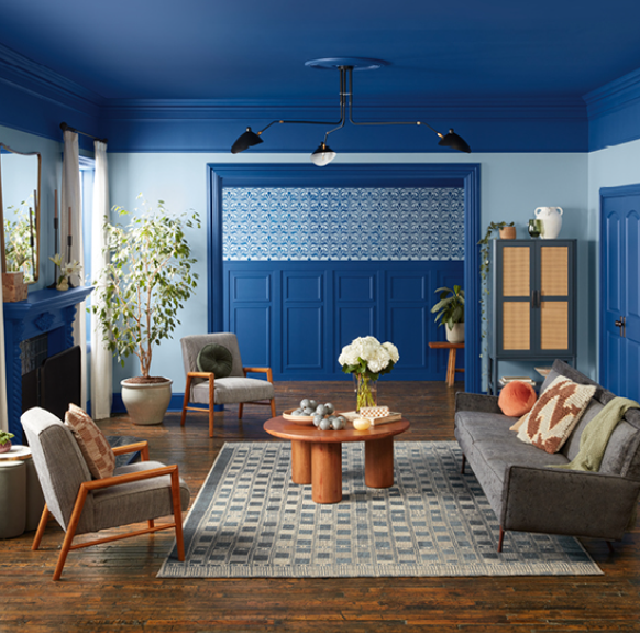
Blues dominated the top hues for 2024, and paint brand Valspar has stuck with that trend, announcing Encore 8002-45G — a rich, saturated, jewel-toned blue — as its choice for 2025.
Paint brand HGTV Home by Sherwin-Williams is offering up Quietude HGSW6212 for its color of the year. The midtone green is calming and serene, perfect for spaces designed for relaxation.
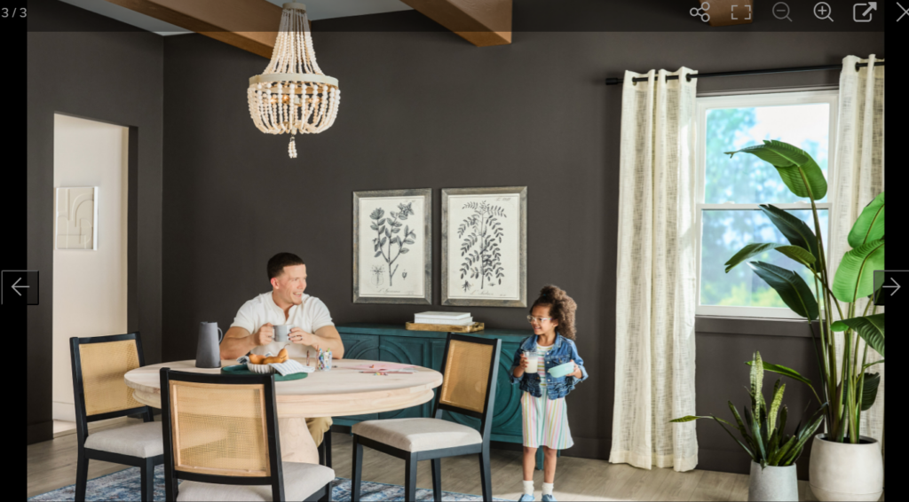
We’ve been seeing richer, more saturated neutrals like Mochi, the top color from U.K.-based paint and wallpaper source Little Greene. The light brown with peach undertones “is a delightful neutral hue (that) works really well in a color-drenched room as an alternative to white, gray or stone,” says Ruth Mottershead, creative director at Little Greene.
Paint and stain brand Stainmaster has gone with a moody deep brown called Truffle as its 2025 pick.
And speaking of moody, color system Coloro and trend forecaster WGSN have selected Future Dusk, a deep blue-purple, as the top hue for next year. “In the near future, the lines between reality and fantasy will become more blurred than ever — Future Dusk is an immersive and transformative color, aligned with this direction,” says Urangoo Samba, head of color for WGSN.
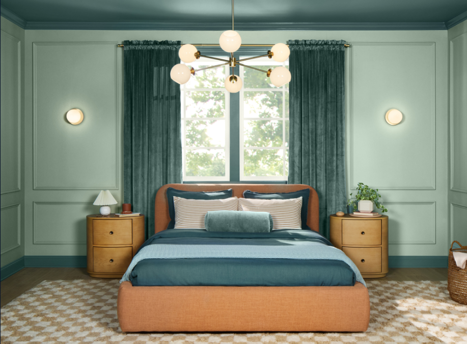
With several companies still set to announce their color of the year selections, it’s too early to suss out trends for 2025. But I wonder, more broadly, if any of the annual picks will have staying power. Quick: What was Pantone’s color of year for 2024? (Answer: Peach Fuzz, a velvety orange-hued pink.)
When we look back 10 years from now, will blues define the 2020s? Will moody, dark hues?
We’re about halfway through the decade. How would you color it?
