

Color as Comfort
By Rachel Fasciani
If the past few years were defined by visual restraint, 2026 is the warm hug of emotional comfort. Designers are embracing warmer, more saturated palettes—jewel tones, layered greens and softened pinks—that wrap spaces in a sense of ease and familiarity.
This shift isn’t simply aesthetic. Designers say it reflects a deeper recalibration in how people want their homes to feel.
After a period of minimalism and muted tones, individuals are gravitating toward spaces with more personality—rooms that offer not just visual appeal, but emotional connection. Color, in this context, becomes less about statement and more about sensibility.
The New Pink
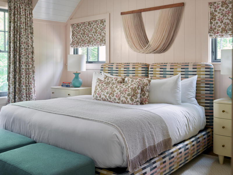
“Muted blush tones feel relevant right now because, while it’s technically a pink, it’s not overly precious,” said Gabriela Eisenhart, founder and creative director of Silo Studio Design in Atlanta. “It’s more muted than a traditional pink, which is why I believe it reads as more sophisticated than sweet.”
That balance is key. Today’s iteration of pink is no longer limited to the color of femininity. It serves as a versatile base tone, particularly when paired with natural materials.
“People are craving homes with more personality and are using more color to express a space’s character,” Eisenhart said. “It almost behaves as a neutral when paired thoughtfully with warm wood tones, raw brass, and natural stone.”
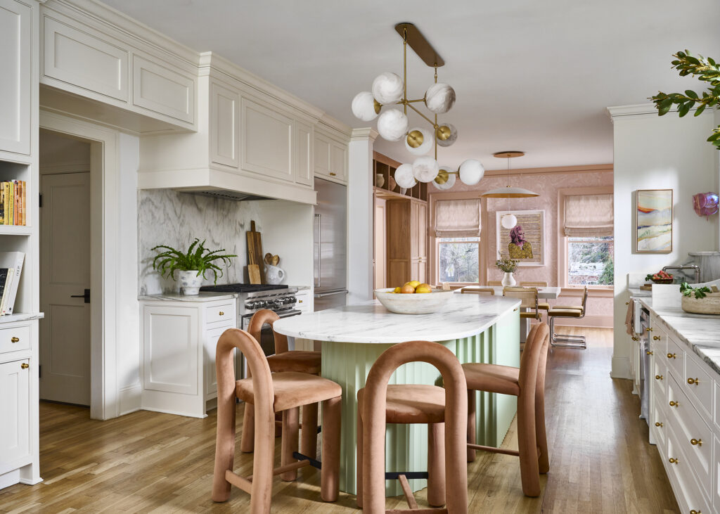
In a recent kitchen and dining project, Eisenhart layered blush tones with natural oak, raw brass, bleached cement and honed marble—creating a space that feels warm, grounded and quietly glamorous. “While I believe it leans more romantic, it can also feel elevated, architectural, and restrained depending on how it’s accented.”
Christine Carney, director of design at Blackberry Farm Design, sees a similar evolution. “Pink has shed its sweetness—it’s no longer precious, but quietly confident,” she stated. “Today it feels less like a statement and more like a sensibility, softening a space with subtle warmth that feels current without tipping into trendy.”
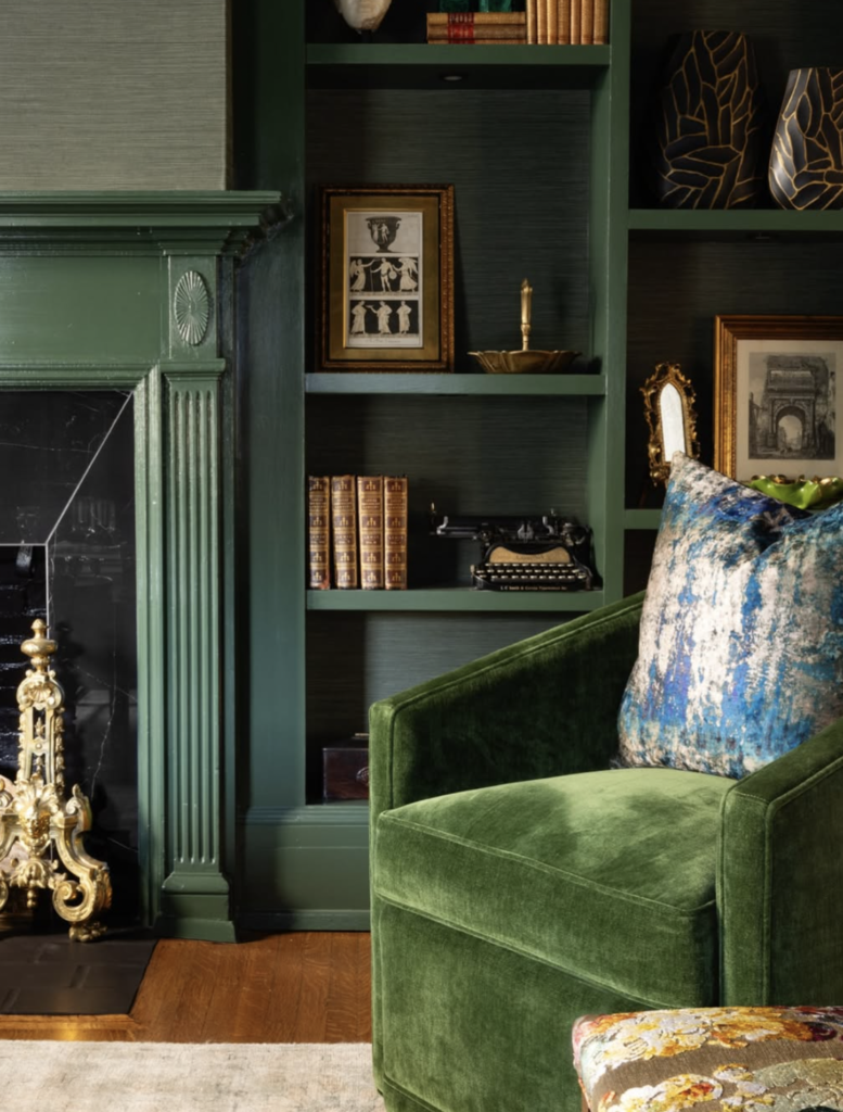
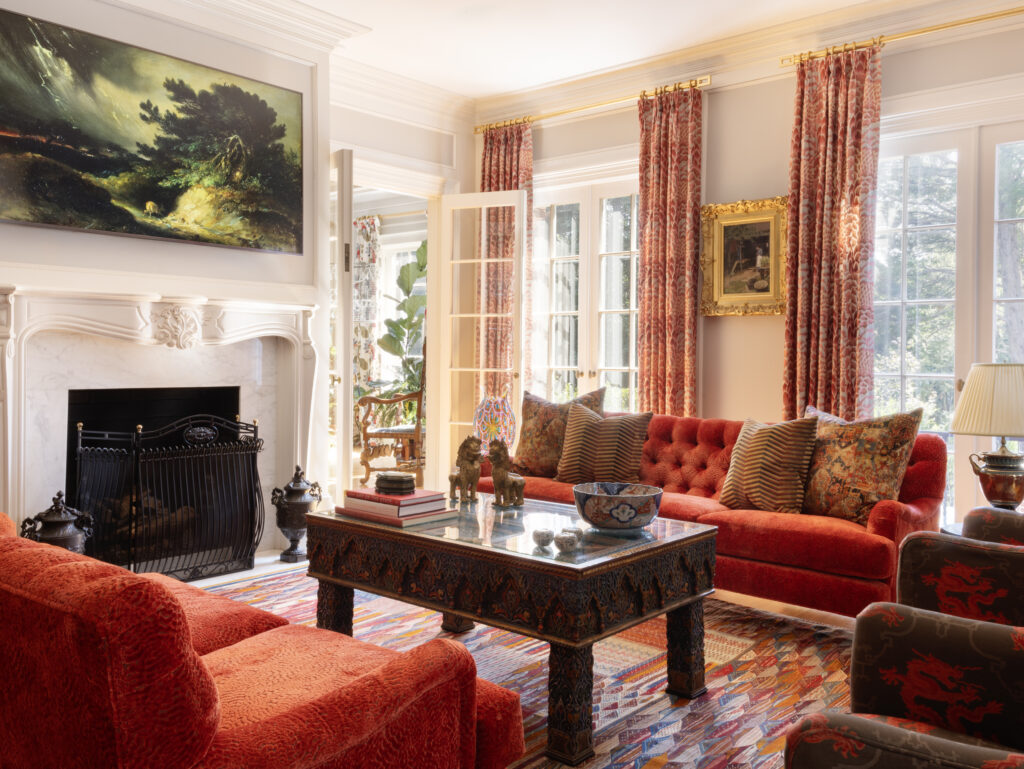
Jewel Tones as Emotion + Energy
Alongside these softened tones, deeper, more saturated hues are gaining traction—bringing a sense of energy and individuality into the home.
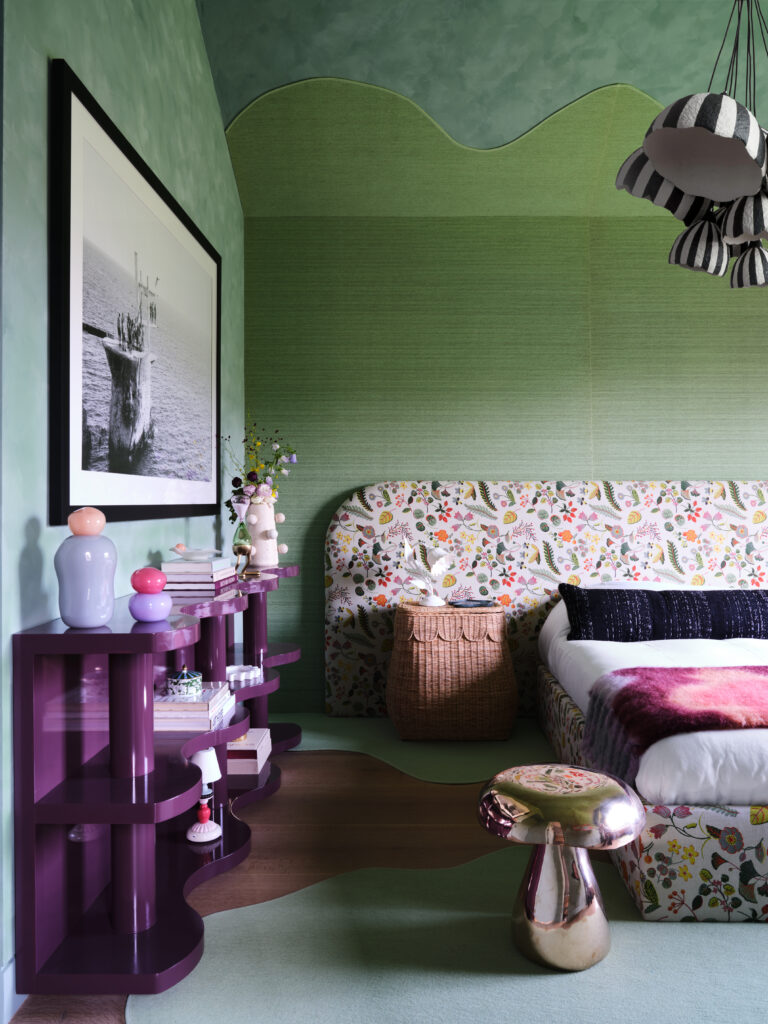
“In this space, it was important to lean into color as a form of self-reflection,” said Sarah Tract, founder and interior designer of her New York-based firm. “The tones and colors throughout the space are bold elements, but as a whole, the room still feels whimsical and soft.”
In this project, a purple jewel-tone console anchors a room layered with green accents, tying into a lavender floral pattern in the bedding. The result is a space that feels cohesive without losing its sense of play.
For many designers, color is less about trend and more about experience.
“Living in color isn’t just a design philosophy—it’s the way I experience the world,” Tract said. “I’ve always been drawn to color and what it brings into a space.”
Raleigh-based designer Tula Summerford, principal of Design by Tula, shared an intuitive take: “Living in color isn’t just a philosophy for me—it’s the way I experience the world. I’ve always been drawn to its power within a space. I’ve always been drawn to color and what it brings into a space. It has an incredible ability to shift the mood, tell a story, and make a room feel alive and energetic. A touch of deep green can ground a space, while brighter tones add energy. I love how color invites you in and makes you feel something.”
Color, it seems, is no longer waiting its turn. It’s leading—confidently and with just enough depth to linger. Perhaps that’s the real shift: not louder rooms, but richer ones.