
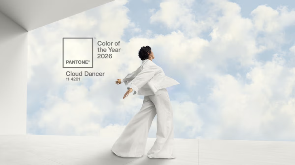
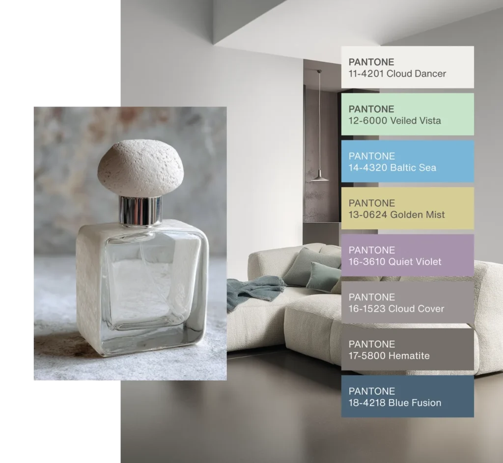
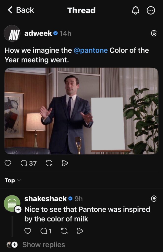
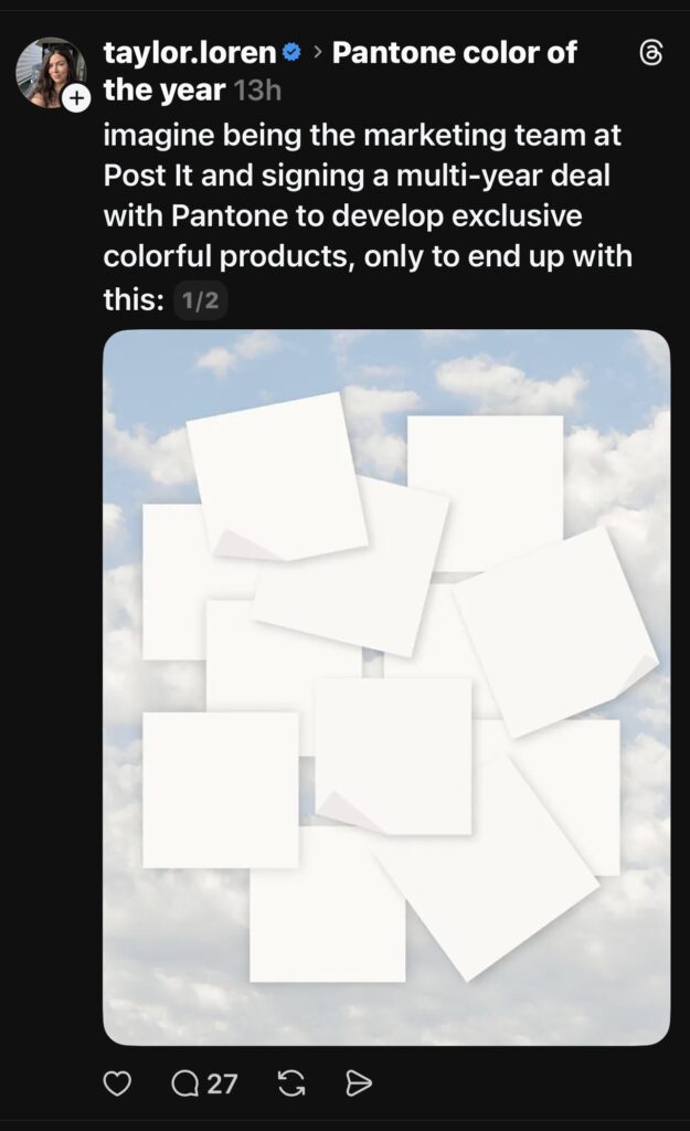
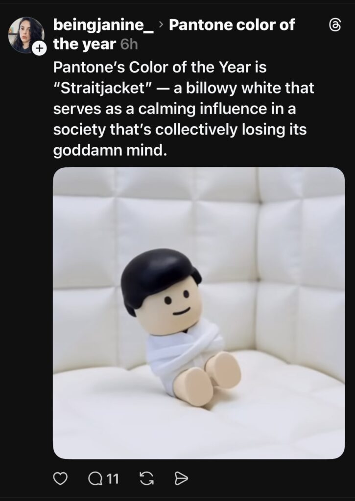
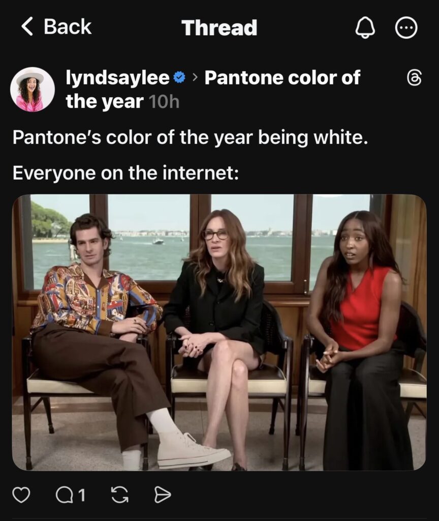
This week, Pantone announced their Color of the Year 2026: Cloud Dancer, a billowy white that blends well into palettes of powdery pastels and soft shadowy hues…. and the People of the Internet had some thoughts.
The internet responds to the Pantone color of the year
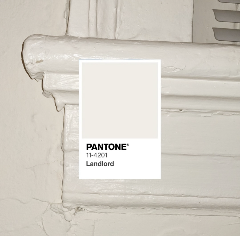
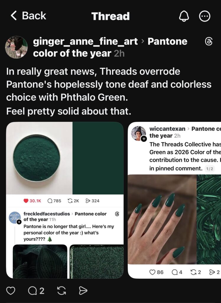
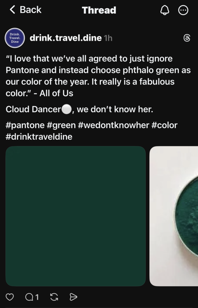
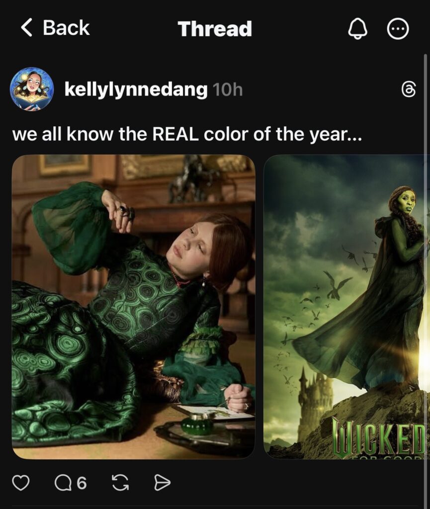
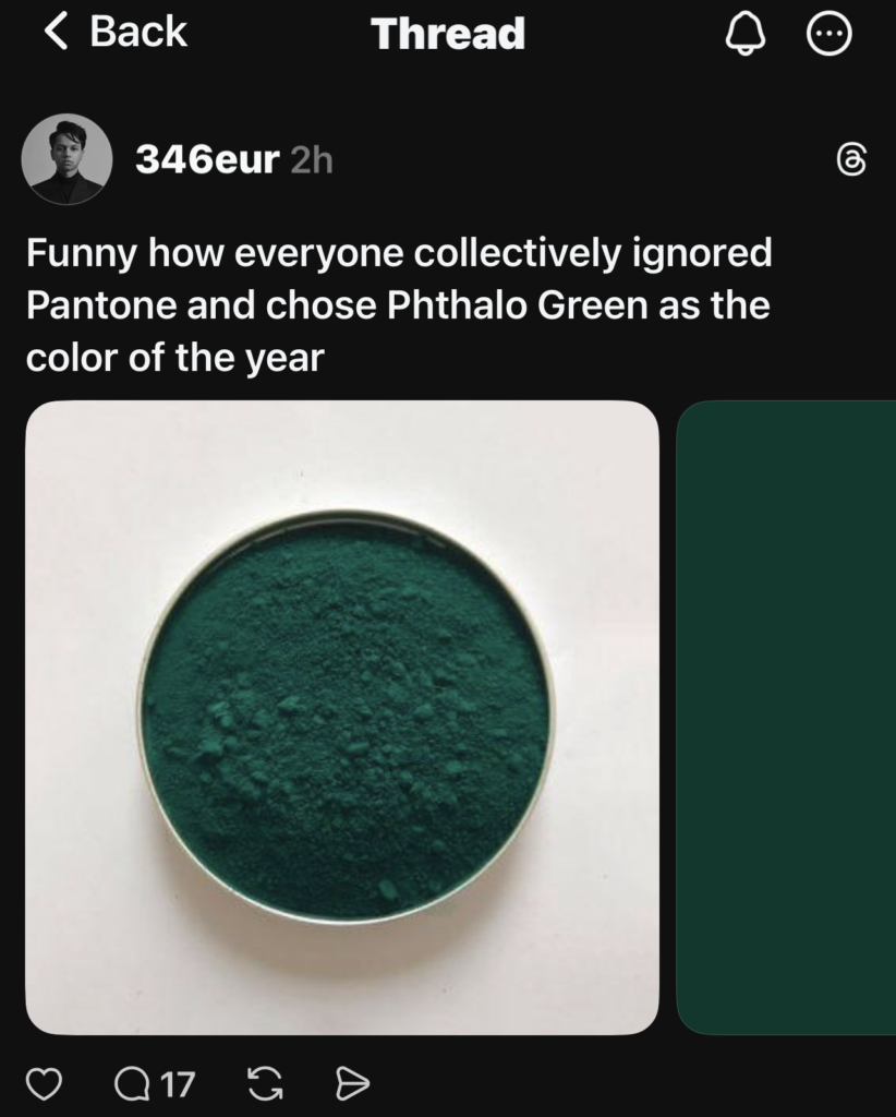
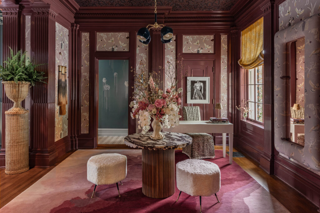
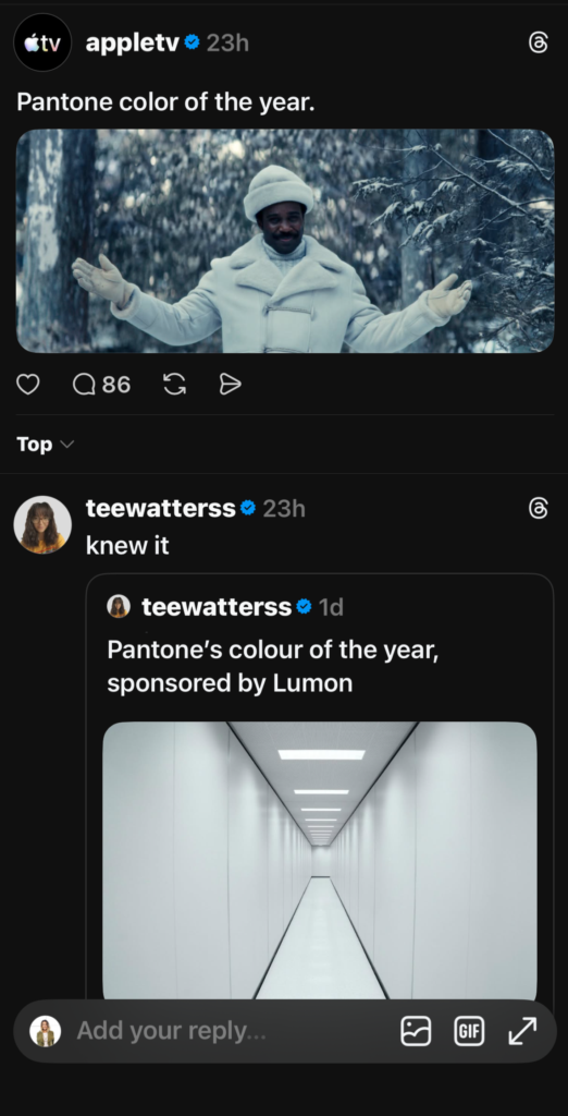
The internet had a field day with this year’s Pantone selection. Criticisms range from calling the COTY pick boring to tone deaf. One viral meme renamed the shade “landlord” white, a reaction to the rising cost of homeownershipin the US, and Threads users banded together to override the decision entirely, declaring Phthalo Green – a shade reminiscent of the Emerald City in Wicked and of Mia Goth’s iconic Kate Hawley-designed gown in Guillermo Del Toro’s Frankenstein (the chosen front runner for the Production and Costume Design Oscars) – the real color of the year instead.

Professionals weigh in on the 2026 color of the year
Threads-users (Threaders?) also praised trend prediction lab WGSN and Coloro for being closer to hitting the mark with their selection, Transformative Teal:
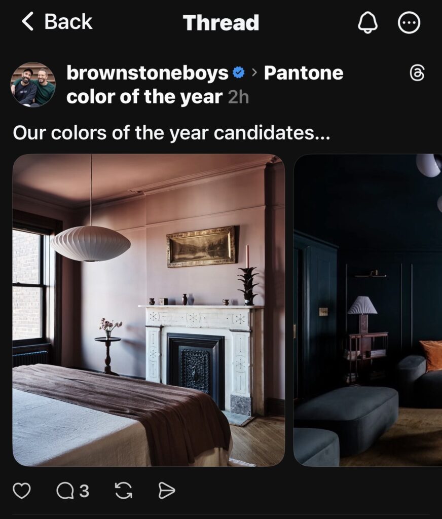
Renowned interiors photographer Brittany Ambridge and the designer duo The Brownstone Boys also responded to Pantone’s COTY by sharing their own color selections, keeping within the moody jewel tone family:
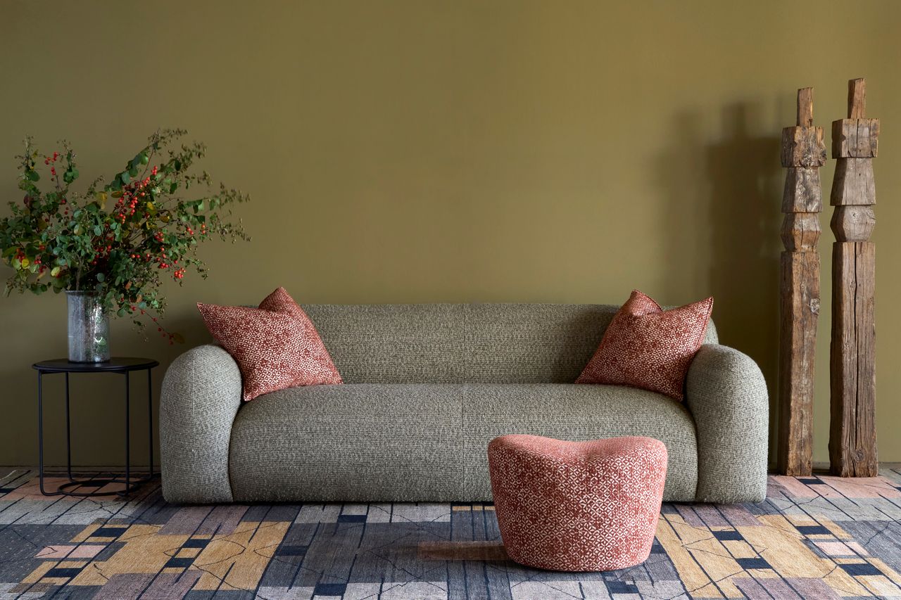
Additionally, four paint brands have named their 2026 Colors of the Year and their selections were in closer alignment to what the People of Social Media and Coloro had in mind. Let’s take a look at how they complement one another and the intentions behind the selections:
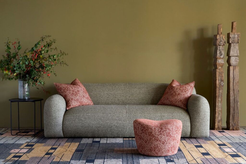
Little Greene: Adventurer
Little Greene’s pick, Adventurer, is a regal aubergine plum that signals the industry’s shift away from earthy browns toward richer, more confident jewel tones.
“The movement toward burgundy represents customers’ growing confidence with color in their homes,“ says Ruth Mottershead, Little Greene’s Creative Director, “Adventurer provides that perfect balance of regal sophistication and intimate comfort.” The brand positions it as a color for clients ready to step into deeper palettes without losing approachability.

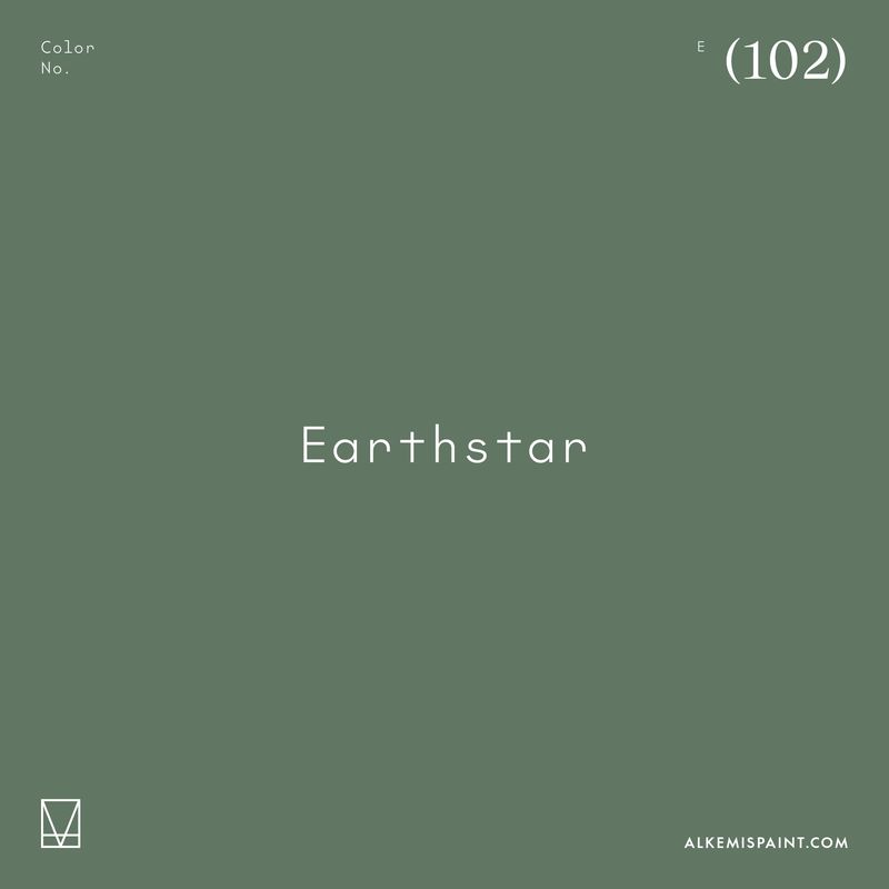
Alkemis Paint: Earthstar
Alkemis Paint named Earthstar their 2026 Color of the Year. “We all need a grounding, earthy green right about now,” says Price Latimer, Co-Founder and CCO of Alkemis Paint, “In a time when our homes have become sanctuaries from an overstimulating world, Alkemis Paint’s Earthstar (102) is the antidote to digital fatigue and environmental anxiety. More than a color trend, Earthstar represents a paradigm shift toward interiors that heal rather than harm people and the planet, grounding us in nature while celebrating a healthier, more sustainable future.”
Earlier this year, Alkemis produced a custom color for the Cisco showroom at High Point Market, aptly named Howdy Cisco, in honor of the late Pinedo Cisco. Not only is the color’s warm earthiness on trend, Howdy Cisco was created with Cisco and Alkemis’ shared affinity for wellness and sustainability at the forefront.
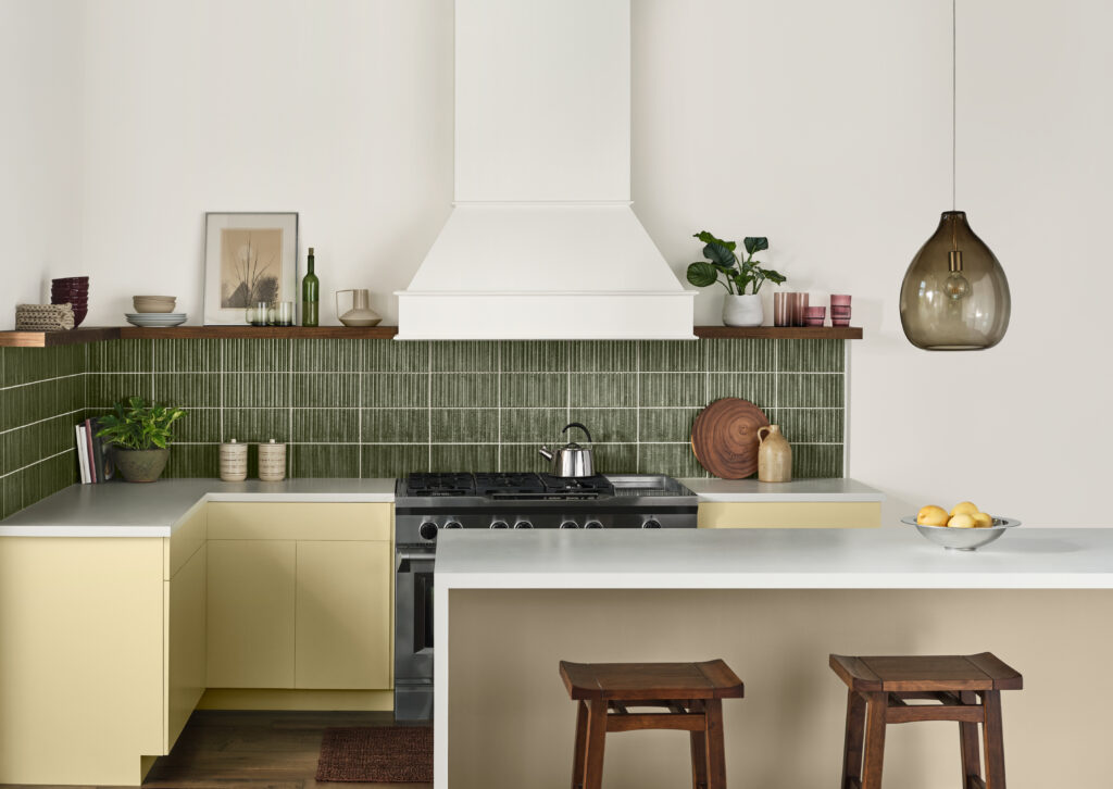
Valspar: Warm Eucalyptus
In the same vein, Valspar leaned into nostalgia with their selection: Warm Eucalyptus, a grounded green drawn from vintage palettes, evoking optimism and comfort through its timeless quality, that also feels playful when paired with bolder hues. (Notably: Shown below in a palette with a frosty shade of blue and muted plum)

Sherwin-Williams: Universal Khaki
Sherwin-Williams and HGTV Home by Sherwin-Williams, which is available exclusively at Lowe’s, unveiled their choice, Universal Khaki. Their neutral selection anchors HGTV Home’s Honest Essentials collection, whose goal is to determine what will resonate with mainstream American homeowners – not design clients. It is no surprise that the more beholden a brand is to appeasing everyone, the more generic the selections will be, relative to designers who are not in the volume business, but rather the business of personal expression.
Universal Khaki pairs nicely with sage, icy blue, butter yellow and plum – bolder choices for color of the year and similar to shades that also found themselves in one of the expanded palettes for Pantone’s “Cloud Dancer.”
For what it’s worth, while the Pantone COTY selection might be boring, the expanded 2026 palette includes greater variety than, say, Benjamin Moore’s 2016 COTY, Simply White, whose complimentary palette suggestions included such daring shades as Paper White, White Mist, and Ballet White.
How the Pantone color of the year is selected and what is it for?
Members of the Pantone Color Institute come from a wide range of backgrounds (science, art, tech, business, etc) and meet throughout the year to analyze and forecast color trends. They are there to be synthesizers of the zeitgeist and reflect it back in the form of color, rather than authorities demanding the use and compliance with their color of the year selection. In other words, to all the upset People of the Internet: Don’t shoot the messenger.
Pantone isn’t telling us what the color of the year should be, but rather what it is (disappointingly milquetoast, in this case). Looking back at the coverage we’ve done this year on the digital flattening of aesthetics and how to invite more variety into your visual theater, I fear they got something right, or at least understand the internet really, really well.
It’s also hard to image Pantone – one of the world’s leading trend predictors – wouldn’t have anticipated backlash to this specific choice because this is how the cycle of online discourse works. Believing ‘all press to be good press,’ is the type of shameless self-promotion that cultural critic W. David Marx argues began with Paris Hilton in the early ‘aughts in his new book, “Blank Space: The Cultural History of the 21st Century,” and it is the engine that powers internet discourse.
In recent history, Sydney Sweeney’s infamous American Eagle “Good Genes/Jeans” campaign ignited similar fury to Pantone’s “Cloud Dreamer” selection. Deemed tone deaf and racially insensitive, it was a big cultural moment that Pantone is well aware of. It provided the blue print for the current conversation surrounding “Cloud Dreamer.” But did it work? Well, for whom? Sweeney caved and apologized this week for the campaign, but did an attempt at capitalizing on divisive discourse work for the brand? Remains to be seen. It did open up an opportunity for other brands to capitalize on the moment by defining themselves in opposition to it.
The case of Pantone’s COTY differs, however, in that they are not one brand selling product. Sure, they’ve monotized themselves with COTY merch, but their primary reason for existing is to aid other brands seeking their data and insights. To that end, the decision to name a shade of white the color of the year, the reflection of all the colors, is a blank canvas to project oneself onto. The degree to which one cares about or has an opinion on the color of the year, much like the Sydney Sweeney “Good Genes/Jeans” ad, is a fairly clear indicator of their politics and of the cultural milieu in which they swim.
To be enthusiastic about “Cloud Dreamer,” is to be unimaginative at best and racist at worst. To not care is to turn a blind-eye to the widening cracks in our culture or live like an ostrich with his head in the sand. To be aware of the discourse involving Wicked and Frankenstein is to be extremely online, and to engage with it is to be an avid consumer of design and media (who probably also needs to unplug for a little while. Set timers and take screen breaks, friends).
If you find yourself learning about the color of the year for the first time from reading this, you might find yourself in the camp thinking Hey! I’m not any of these things — It’s a dumb color choice but it’s just a color. Why is this dividing us further? — a position related to but still distinct from the truly indifferent and one that misses the point entirely. The style of one’s caring or indifference is a key data point which signals to brands how to advertise to you or if you’re worth spending ad dollars on at all.
Amidst the digital chaos, white space is everything and nothing at once. It’s a cultural Rorschach test. There’s no right or wrong reaction, there is just brand data. How you react sticks you in an algorithmic box to feed you more of what you’re likely to purchase in the form of advertisements, whether that is “Cloud Dreamer” colored products or something more inspired.
For fun, I’ll leave you with a few more pithy social media responses to Pantone’s color of the year, “Cloud Dreamer” from the extremely online. And until next time, everyone should go outside and touch grass — Phthalo Green grass, if you will:

