Field Notes: Show + Tell

By Jane Dagmi
The first time I covered Interwoven as an editor, I did not know a thing about how the textile trade show worked. Nor did I know any of the fabric folks.
To find my way that first time, I trailed the president of an upholstery company and her chief merchandiser from showroom to showroom. They were treated like royalty. As collections were presented, I watched them nod approvingly and check items off long lists of new introductions. I also saw them cock their heads to the side or wave a hand dismissively as if to say, “next.”
Eight years later, I still enjoy gathering Interwoven intel through the eyes of creative directors and upholstery merchandisers who have a vision, use cloth to communicate it, and then dazzle all of us at Market by telling stories through color, pattern, and texture.
This season at Interwoven, I asked the following home furnishings pros to share what inspired them most at the show.
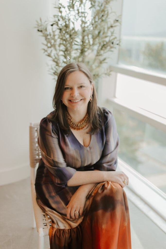
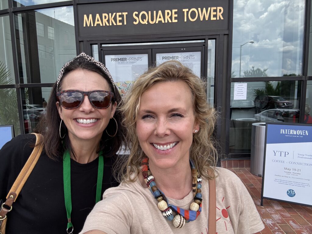
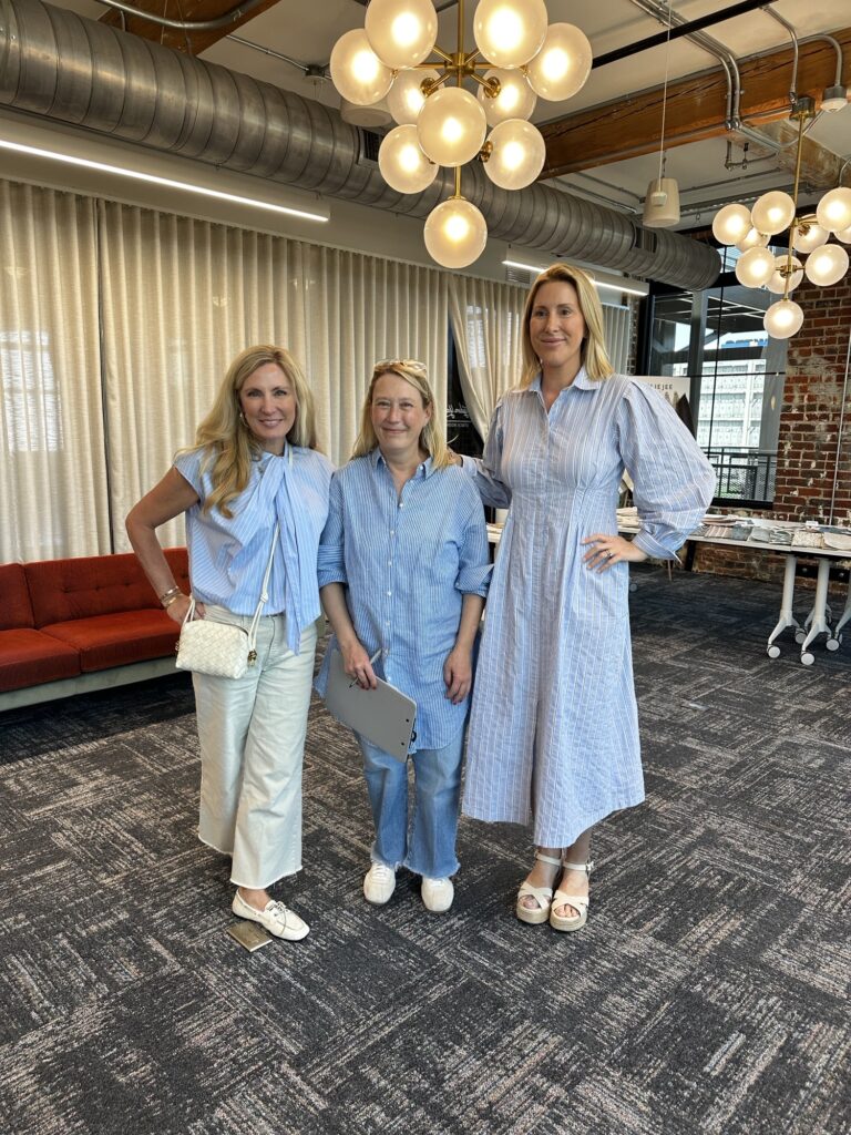
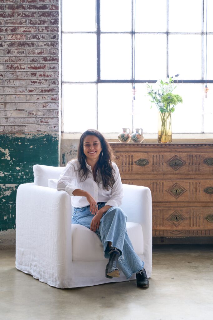
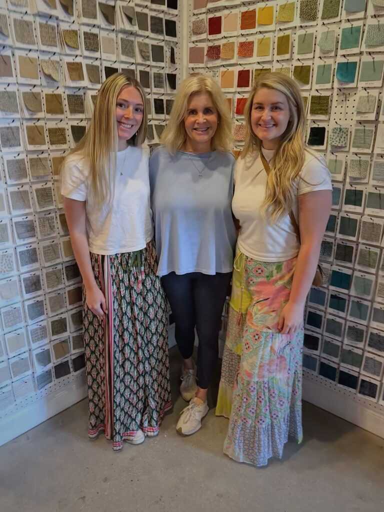
While many of their observations naturally overlapped, each explored the show through their own lens, keeping both present customers, future clients, and the stories they want to tell in mind.
Color
Neutrals aren’t disappearing, but they are broadening to include a growing range of hues drawn from the natural world.
A warmer palette dominated Interwoven. Hooker Furnishing’s Misty Ellis noticed layered browns, rich greens, aubergine, and terracotta surfacing throughout the market.
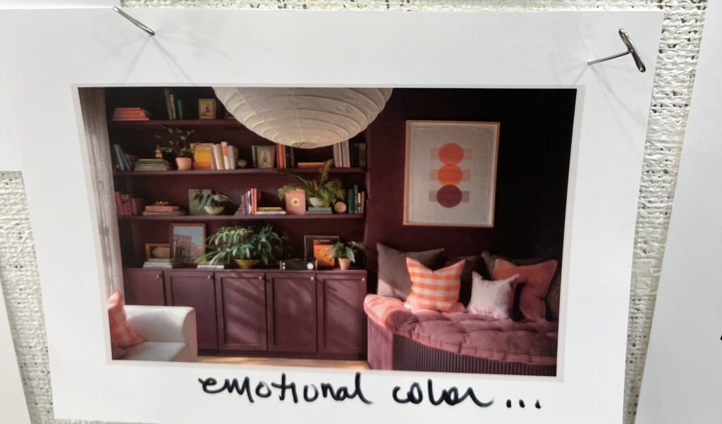
Robin and her team at Theodore Alexander gravitated toward shades of aubergine too. “We continually saw deep burgundy-plum hues with a softened earthiness and muddy undertones rather than high-gloss vibrancy. We loved the sense of warmth, and understated drama from this color story.”
Cass Key at Taylor King noticed a similar softening of the palette. “Colors are trending back to the soft earth tones, apricot, sand, clay, burnt sienna with a little citrine and soft plum mixed in.”
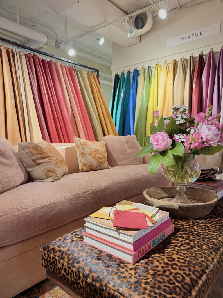
At Sherrill, deeper saturation also emerged as a defining direction. “There’s a richness to the deeper tones that really stands out this season,” said Reese Essick.
Dimensionality
For those choosing upholstery that embraces and supports the body, texture becomes a huge differentiator.
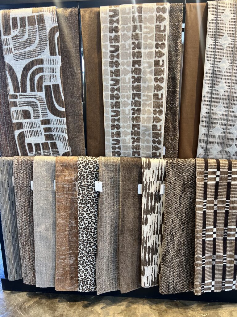
“One of the strongest themes throughout the show was elevated construction—especially jacquard plains designed to resemble differential weave textures, adding subtle dimension and interest to foundational fabrics,” said Misty Ellis. “Sheen also remained incredibly prominent across a variety of constructions, bringing a refined richness and light-reflective quality to many collections.”
Hoff noticed a similar return to richly layered surfaces, especially tapestry constructions with “intricately woven floral textures that create artisanal depth.”
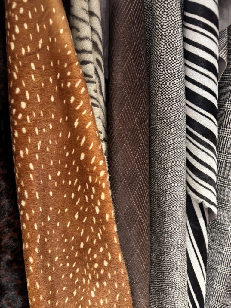
Key also observed an abundance of jacquards and tapestries. With western customers in mind, she also honed in on sturdy yet soft wool and alpaca blends for body cloths.
Heritage Redefined
With traditional style on the rise, generous doses of nostalgia surfaced throughout Interwoven.
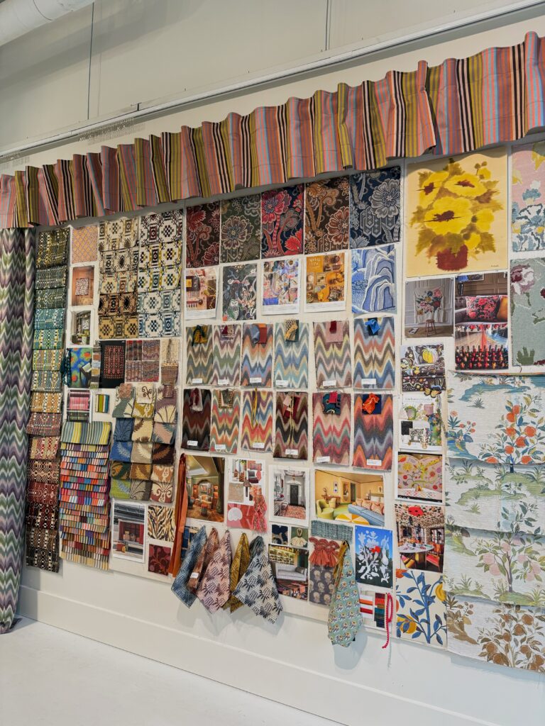
Alongside tapestry constructions, Ellis noticed damask “being reimagined in a more modern, artful way.”
Key had a case of the stripes.
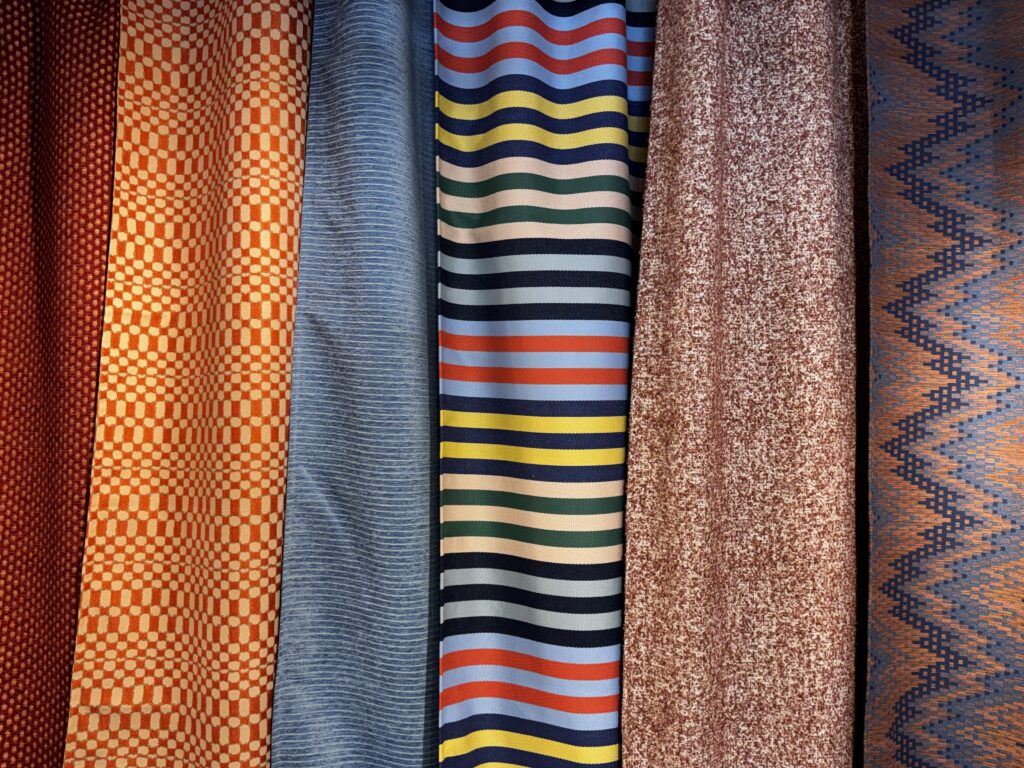
“Stripes were the rage for us this market,” she said, calling attention to beautiful woven blanket stripes from GP & J Baker, a fresh multi-color combination at Crypton.
Leather, always a staple and a strong performer with western customers, was a textile category that Key wanted to spend time with.
“Leather was a big focus for us at this show because it’s so important to view the full hides to accurately gauge the hand, texture and even raw hide quality. You really cannot get the same result from looking at the samples.”
Key was especially taken with the way Penelope incorporated a leather whip stitch into one of their new stripe fabrics.
During a visit to Brentwood Textiles, head designer Kathy Dotterer alluded to the return of paisley.
Beyond the aesthetics of heritage, Key remarked that she loved seeing young professionals entering the industry. She met a graduate of NC State’s textile program at King and noticed similar next-generation involvement at Hamilton and Cadore, where family legacies are continuing to evolve.
“It’s encouraging and worth celebrating in my opinion!” Key said.
Value
With an eye on price point and value, The Sherrill team was excited by a trend that may not be immediately visible, but is deeply felt: the growing accessibility of elevated design. Fabrics that deliver a high-end look at an appealing price point are gold.
“What’s especially exciting isn’t just the visual impact, but the value behind it,” said Essick. “For our team, that balance of elevated design and accessibility is what makes these collections so compelling, allowing us to create pieces that feel rich and intentional without sacrificing value for the customer.”
Fashion Play
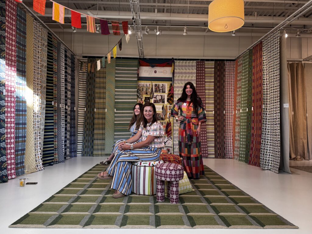
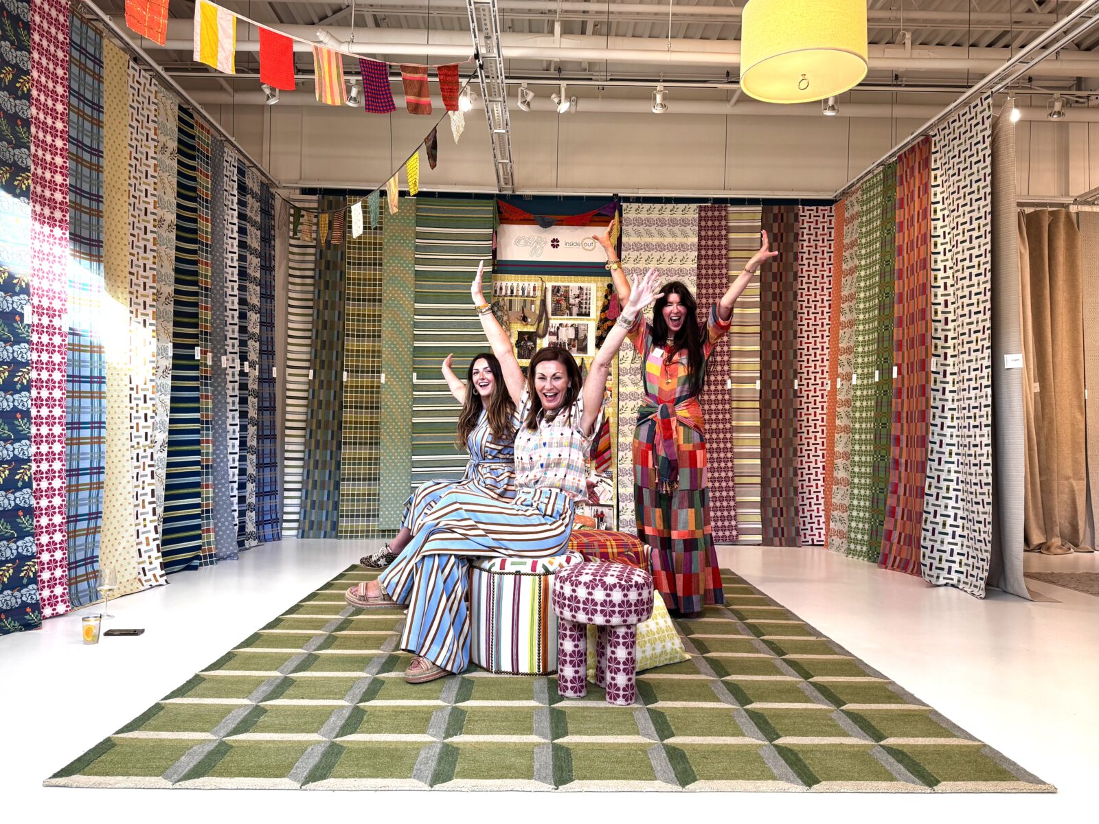
One of the most spirited collections at Interwoven was the collaboration between women’s clothier ace&jig and Valdese Weavers. For Maurishka Pinedo, that crossover between interiors and fashion felt especially fresh and even sparked a little self reflection.
“Although it’s not necessarily for Cisco, I think this collection shows how there is more and more intersection with fashion and interiors,” she said. “Seeing it from a supplier made me stop and think about the fashion details I have been considering lately—and to just go for it.”
My Turn
That collection at Valdese was also a personal highlight. I loved its nostalgic spirit and I was fortunate to connect with ace&jig cofounder Cary Vaughan.
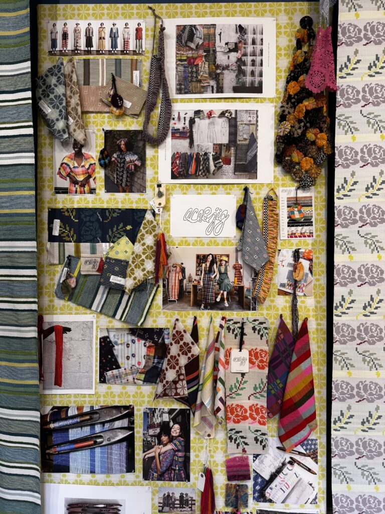
Pointing to a fabric called “Namesake,” inspired by peeling wallpaper in her grandmother’s house in Maine, Vaughan said, “Textiles tell stories. They’re tangible and spiritual—there are memories involved.”
In the coming weeks, Ellis, Key, Pinedo, and countless other merchandisers will receive boxes of memo samples ordered at Interwoven. Some fabrics will become “definites,” others “maybes,” as the visual story for October High Point Market begins to take shape.