
At the Ambiente fair in Frankfurt this February, the clearest through line was not a particular color or a material but a behavior: an impulse to design objects that perform care work and, increasingly, make that care portable. Across furniture, lighting and housewares, products were designed as tools for navigating climate pressure, mobile living and uneven access.
In Cruel Optimism, cultural theorist Lauren Berlant argues that the ideals and objects we attach to for security often expose the fragility of the conditions they are meant to soothe. Design does not resolve that tension; it gives it form. At Ambiente, sensitivity to rising tensions coalesced into five dominant themes that gave them form:
- Warmth and portability
- Universal design
- Cooling as process and aesthetic
- Joy and play
- Woven craft from around the world
Expressed through softened forms, adaptive grips and regenerative material stories , these products translate uncertainty into usable, everyday comfort. What follows are the cultural forces shaping the season and the products that bring them into focus.
1. Wrapped up: warmth and portability
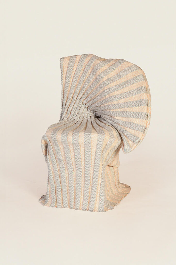
Korean textile artist Minjung Kim moved around from one pre-furnished apartment to another. To combat loneliness and a lack of inspiration, she began designing soft textile shells to wrap generic furniture, giving it character and a sense of continuity.
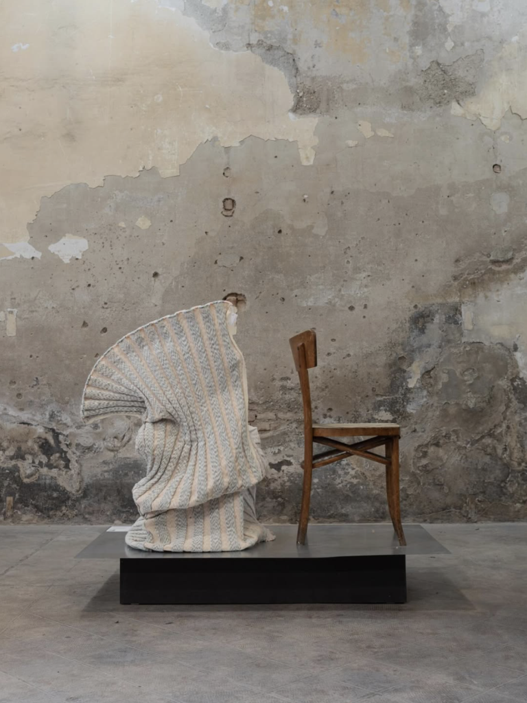
Her collection, shown in the Talents program at Ambiente, treated fabric as both insulation and personal expression.
While Kim’s work first endeared me to the relationship between warmth and portability, the theme was recognizable in products across categories and price points, such as David Fussenegger’s children’s blankets fold into animal “puppets,” combining storage, play and comfort.
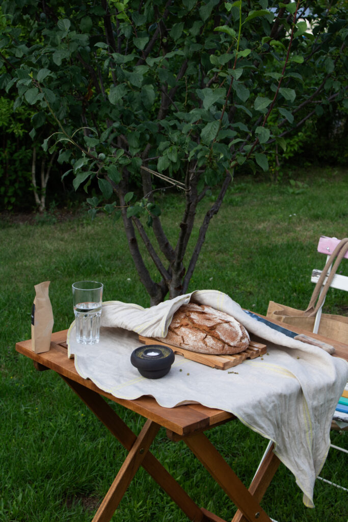
Laib & Leinen by product designer Johanna Printz is a simple, elegant two-piece set comprising a bread cloth and cutting board, made from undyed, food-safe linen and linseed-oil-treated oak to support storage, slicing and presentation while encouraging a more mindful relationship to everyday bread. The cloth is also meant to be tied, in the style of Japanese furoshiki, to transport the bread or keep it fresh and tucked out of sight.
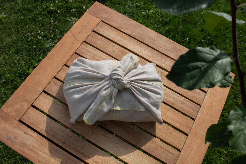
Laib & Leinen emerged from a 2025 collaboration between the Product Design program’s Design & Social Context group at Berlin University of the Arts, U·S·E Berlin and DIM Berlin’s inclusive workshops, with nine works from the initiative selected by AW Architektur & Wohnen for its Online Newcomer Shop and in their magazine.
When home is no longer a fixed location but a condition meant to be replicable anywhere, these objects perform emotional labor alongside their practical functions. They offer small zones of control within spaces that feel temporary or otherwise impersonal.
2. Universal design: health and access in the kitchen
Nowhere was the language of care more explicit than in the kitchen, where wellness and inequality are most visible. Tools were shaped to accommodate a wider range of bodies and abilities, with grips, angles and mechanisms designed to reduce strain and increase precision.

Product designer Maria Isenia Spatola spent time volunteering in kitchens, preparing meals for people in need. There, she collaborated with elderly people, young adults and children alike, observing the various difficulties people faced during food preparation due to their size or disabilities. That sparked her interest in finding practical, inclusive solutions and thus Insenia Design was born. Her 3Modality utensil, for example, combines chopping, grating and sifting in a single compact form, using oscillating motion and differentiated surfaces to minimize effort.
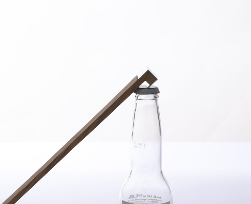
Her sleek PivotPop bottle opener amplifies force through lever mechanics, making bottle opening easier for those with hand impairments.
At Ambiente, wellness extended beyond what is consumed to the instruments used to prepare it. Microplastic-free tools and regenerative surfaces (like those used in Printz’s bread wrap) paired with ergonomic design to embed health in the everyday.
3. Turning down the temperature: cooling as process and aesthetic
As global temperatures rise, cooling has become both a technical and visual concern. Product designers made thermal regulation visible, using evaporation, mineral growth and porous ceramics as formal drivers.
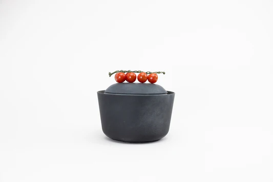
Tomeo by designer Noelle Loke is a clay container that cools delicate foods such as tomatoes through evaporative cooling, maintaining an interior temperature of about 13 to 17 degrees Celsius without electricity and preserving flavor lost in refrigeration. Drawing on traditional clay cooling techniques Tomeo was also part of the recent collaboration between the Product Design program’s Design & Social Context group at Berlin University of the Arts
Sheep Craft’s Racer Sustainable Ceramic Cooling System drew on Muscatese evaporation principles to create a porous, electricity-free cooling device from recycled ceramic waste, functioning as infrastructure and sculpture at once.

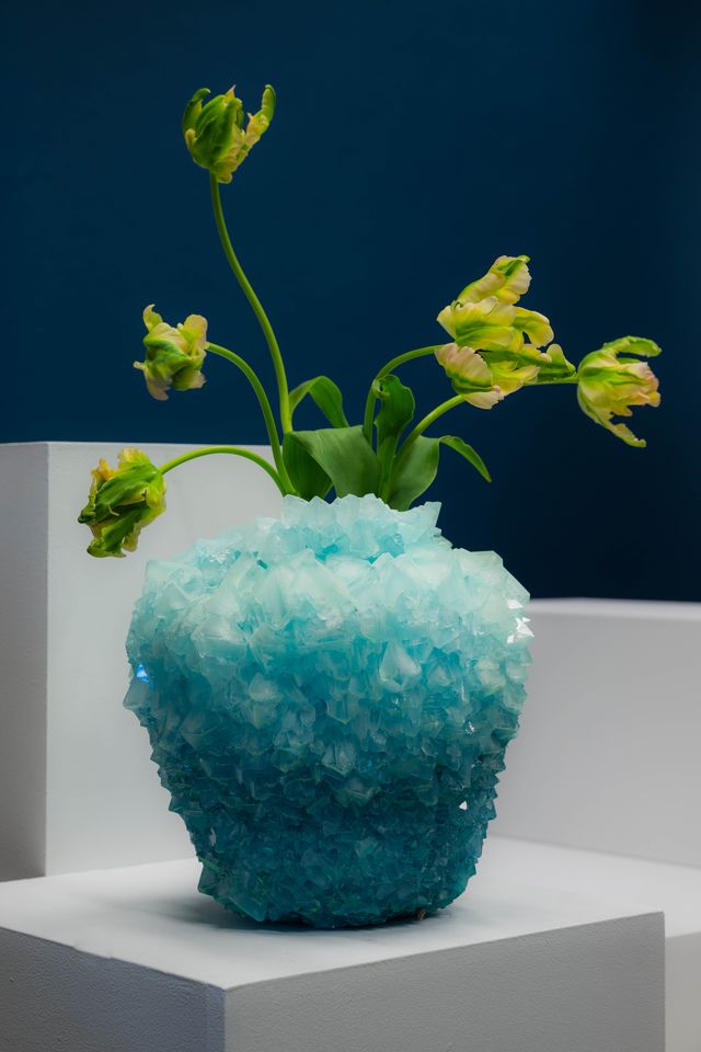
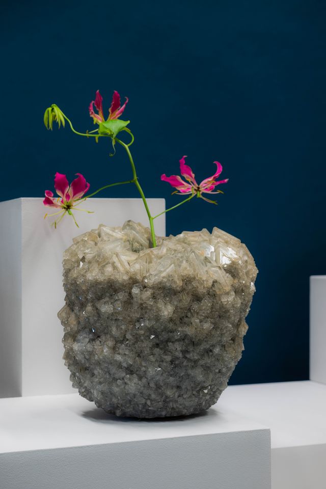
Founded by artist Isaac Monté, Mineral Series produces handmade crystal decorations in the Netherlands by ‘growing’ mineral crystals through a controlled process of dissolution, heating and gradual cooling, shaping both their form and color. By combining multiple minerals, oxides and pigments, he produces a spectrum of hues, while the slow crystallization ensures that each piece develops uniquely in texture, structure and tone.
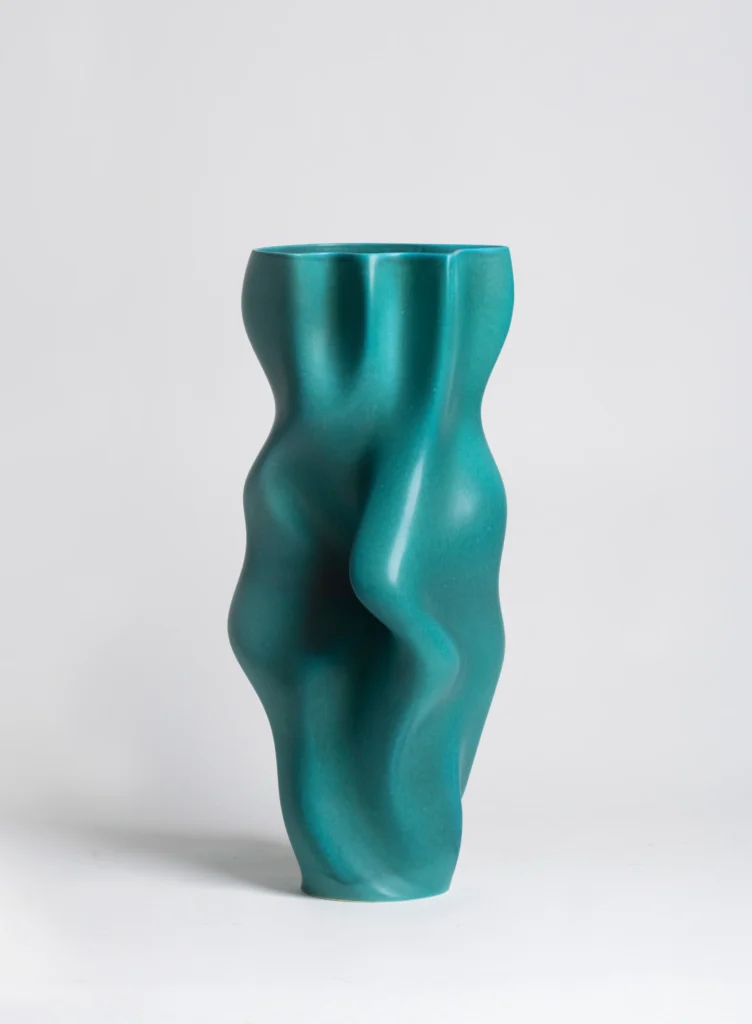
Claraval’s Foz Collection translated the cooling sounds of Portugal’s Douro River into algorithmically generated ceramic vases, turning temperature and sound into surface and volume.
4. Joy and play
After years of anxious minimalism and the short-lived digital trend “dopamine decor,” playfulness returned with a greater discipline. Candy hues and rounded silhouettes were reminiscent of childhood and confections without tipping into novelty or kitsch.

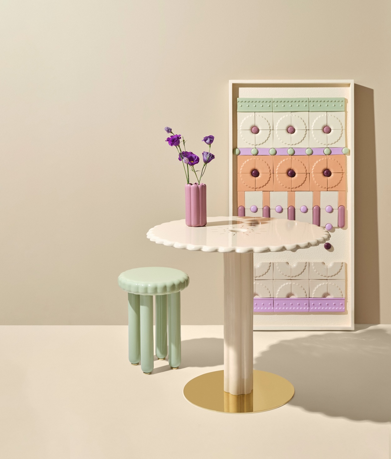
Studio Yellow Dot’s Patisserie collection, for example, drew on the colors and scents of a pastry kitchen, translating dessert tones into ceramic furnishings.
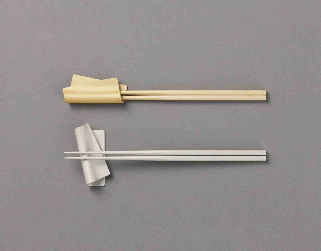
Tsuboe’s Irogami chopstick and accompanying rests repeated a single form across a spectrum of colors, encouraging collectibility and personalization through their palette rather than shape.
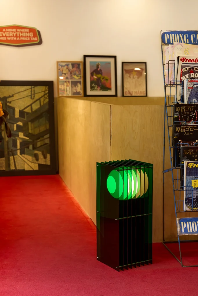
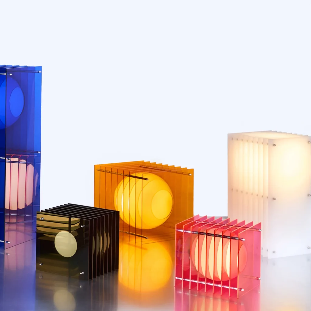
Bang Unboring Objects’ lamp doubled as a side table and vinyl holder, and changes color depending upon the angle you view it from.
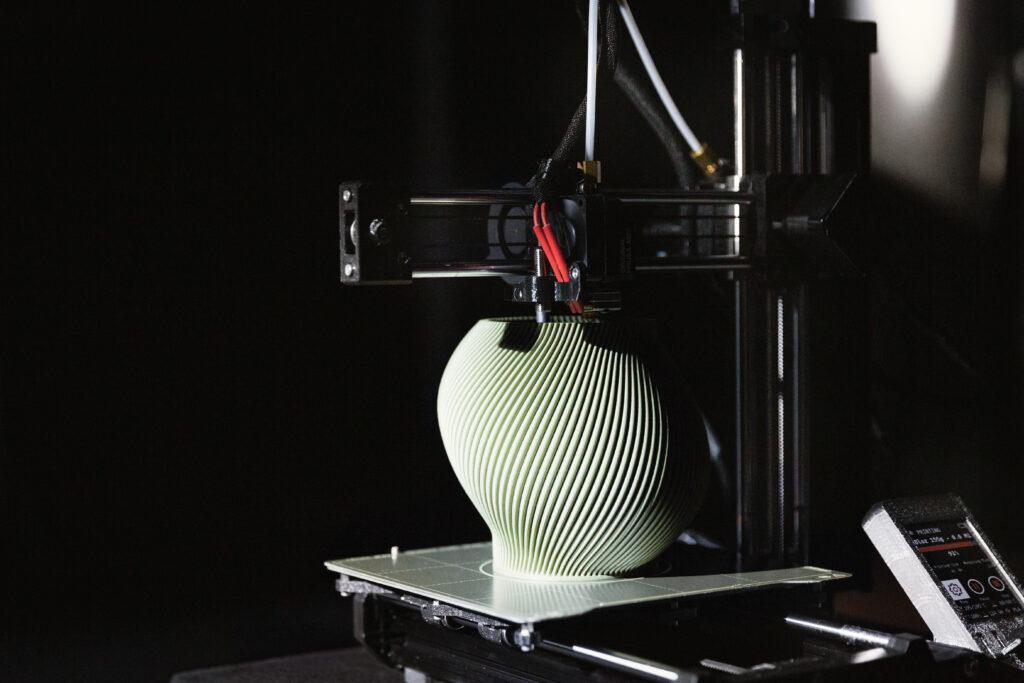
Sheyn’s 3D-printed pieces used plant-based materials and minimalist geometry to balance sustainability with softness and vibrant expression.
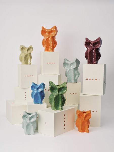
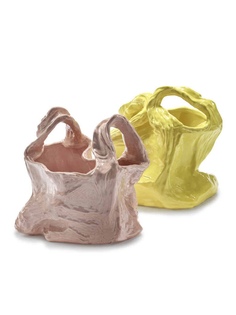
Marni’s owl vases for Serax and their colorful new “plastic bag” ceramic sculptures leaned into character and humor without abandoning function, beauty or quality.
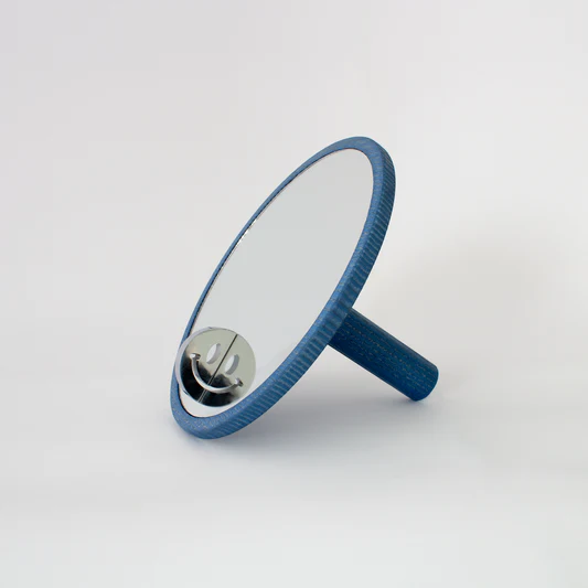
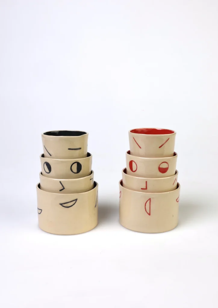
“Cheeky Mirror” by Gustav Sundberg and “HowRU” by Aaron Slupinsky share a playful approach to everyday objects, blending function with graphic personality. Sundberg’s hand-held or freestanding mirror in glass, birch and chromed steel features a smiling reflection.
Slupinsky’s stackable ceramic cups form a changeable face when arranged together. (Also, each cup actually holds the same volume. Clever!) Both products were also developed as part of the 2025 collaboration between the Product Design program’s Design & Social Context group at Berlin University of the Arts.
These emotionally calibrating pieces suggest that care need not be solemn to be serious.
5. Woven craft from around the world
Woven furniture and lighting reintroduced the human touch at a moment when design is increasingly automated. Drawing on weaving traditions from India, Japan and Mexico, these pieces translate regional techniques into contemporary forms for a global audience.
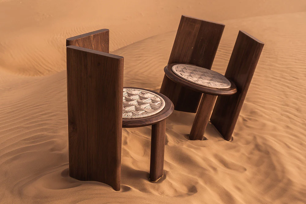
Indian designer Jagdish Sutar applied traditional weaving methods to sculptural seating and beds.
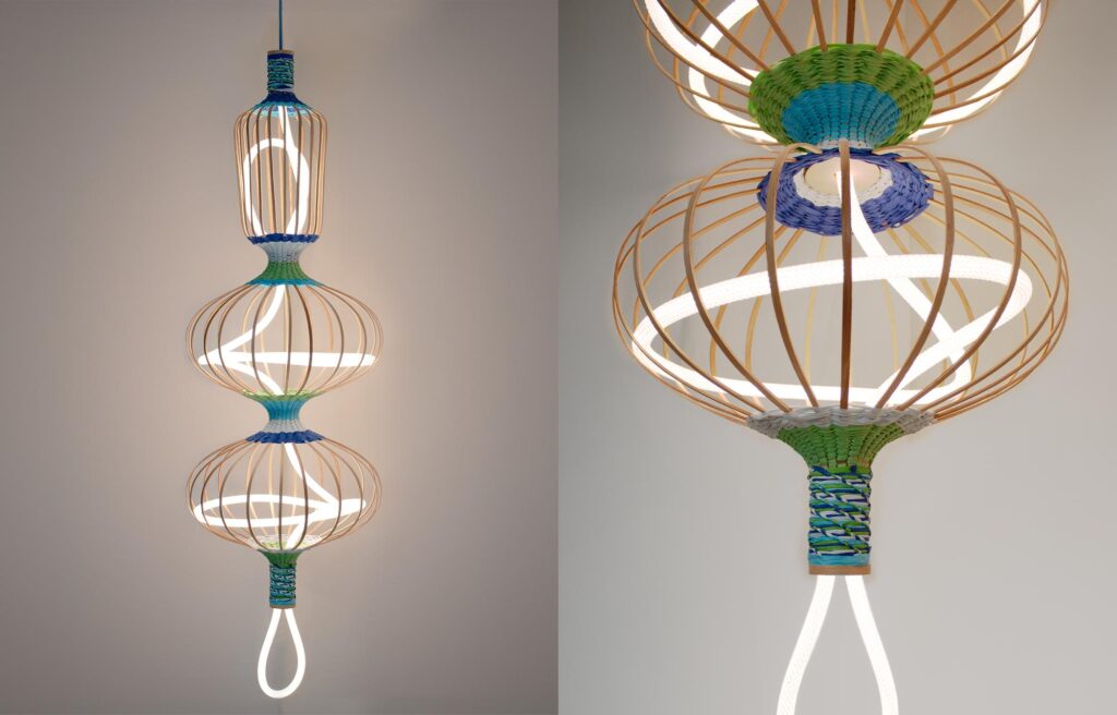
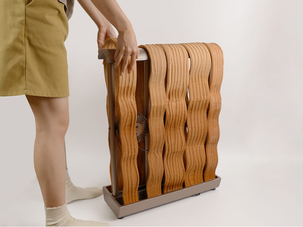
Amy Lewis drew on her Japanese heritage for woven light fixtures and room dividers that balanced structure with translucency.
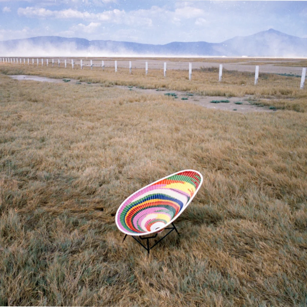
Acapulco Design’s customizable Jalisco chairs used Mexican weaving techniques to animate asymmetrical frames with electric color.
In a culture seeking steadiness, the domestic object becomes a kind of emotional technology, translating global disorder into manageable acts of daily use. Design’s promise at Ambiente was the ability to make everyday life a little lovelier, one tiny design intervention at a time.