
Forget the Color of the Year. Ask the People Making Design.

The design world isn’t waiting for a single shade to tell it what’s next. Here’s what the people shaping interiors are seeing for 2027.
For years, the design world has waited for someone to tell us what color comes next.
If the past few years have taught us anything, it’s that the most interesting color stories aren’t always coming from the official Color of the Year announcements. The room often tells us first.
And if design was trying to tell us something in 2026, nothing made that clearer than Pantone’s selection of Cloud Dancer — a whisper of white that, depending on your mood, could also be called depression.
The good news? The design world doesn’t appear to be in the mood for beige, gray or anything remotely depressing in 2027.
So rather than ask a paint company, we asked the people actually shaping interiors — designers, creatives and product insiders — what they are seeing, using and craving as we move into the next year.
Their answers weren’t about one shade. They were about mood.
Color is getting warmer. Richer. Bolder. More saturated. More immersive. Blues and greens are holding their ground, while chocolate, caramel, ochre, oxblood, terracotta, yellow and even the once-reviled purple are pushing their way into the conversation.
And perhaps most importantly, color is no longer content to sit politely on an accent wall.
It is moving onto cabinetry, upholstery, tile, stone, walls and ceilings — enveloping rooms rather than simply decorating them.
Forget the swatch on the wall. The real color story for 2027 is much bigger.
Warmth Takes the Wheel
Cool grays had a very good run. But according to the designers and creative insiders we spoke with, their reign is fading in favor of colors that feel warmer, richer and more emotionally resonant.
Isabel Ladd of Isabel Ladd Interiors is seeing “deep, bold, warm colors” take over from the cooler shades that have dominated interiors for years.
That shift is evident in Ladd’s own work, where sunny yellow cabinetry and trim meet patterned walls and ceilings to create a room that is anything but restrained.
At Sunbrella, executive director of Global Design Greg Voorhis is seeing a similar appetite for optimism. He points to apple green, citrus yellow, sky blue, indigo, golden yellow and terracotta, balanced by warm earth tones and tactile neutrals.
The message is consistent: color is getting warmer, but it isn’t necessarily getting louder.
The new richness comes from shades that feel grounded, livable and connected to nature.
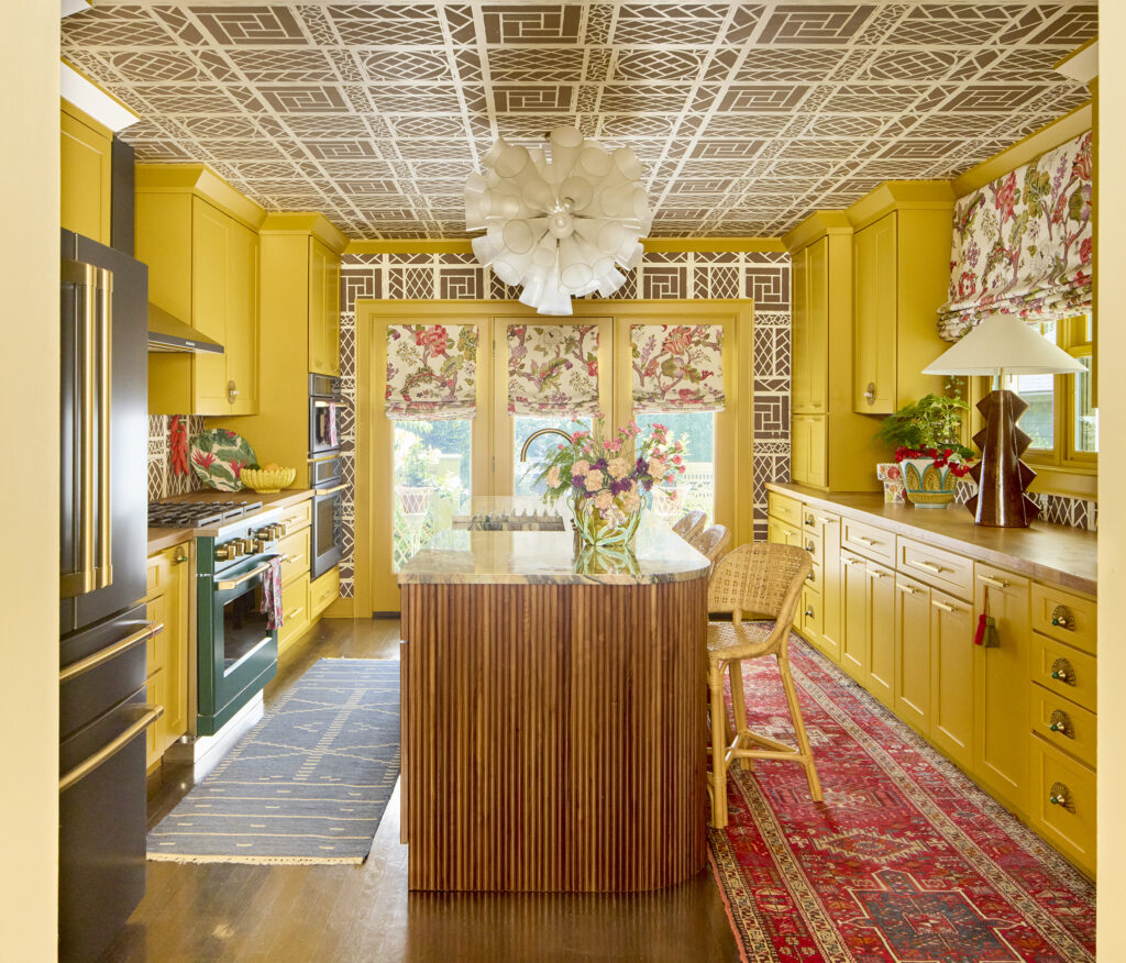
“I’m seeing many deep, bold, warm colors moving forward and dominating over cooler colors that have long reigned.” Isabel Ladd, Isabel Ladd Interiors, Lexington, Kentucky
This kitchen by Ladd uses warm sunny yellow cabinetry and trim offset by patterned ceilings and walls. Photo: Adam Albright
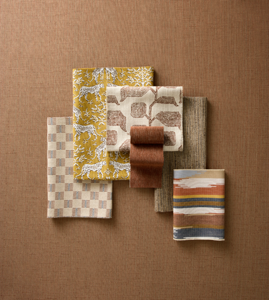
“We’re seeing designers lean into the vitality of nature with color that feels optimistic, unexpected and a little more playful. Color is becoming more vibrant and expressive through shades like apple green, citrus-inspired yellow, sky blue, indigo, golden yellow and terracotta, balanced with grounding, textural neutrals and warm earth tones to create palettes that feel both fresh and livable.” Greg Voorhis, executive director – Global Design, Sunbrella.
A selection of warm toned fabrics from Sunbrella’s Fusion line.
A richer shade of neutral
If there is one family of colors that seems particularly poised for a bigger moment, it may be brown.
Caramel. Chocolate. Chestnut. Oatmeal. Sand.
These are replacing the cooler grays and charcoals that have defined neutral palettes for years, but they are also doing something more interesting: providing a warm foundation for stronger colors.
DuVäl Reynolds of DuVäl Designs is seeing deep earthy greens and olives, caramel and chocolate browns, burgundies, ochres and muddier blues move forward.
And he’s noticing a bigger shift in how designers are deploying those colors.
“It’s not just an accent wall or a pop of color anymore,” Reynolds says. “We’re seeing it in cabinetry, upholstery, stone, wood, and full color-drenched rooms.”
That may be the more important story for 2027. Color isn’t simply being added. It’s being enveloped.
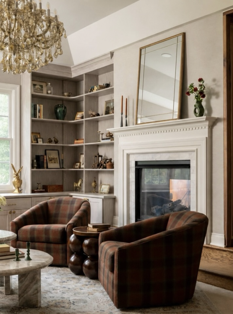
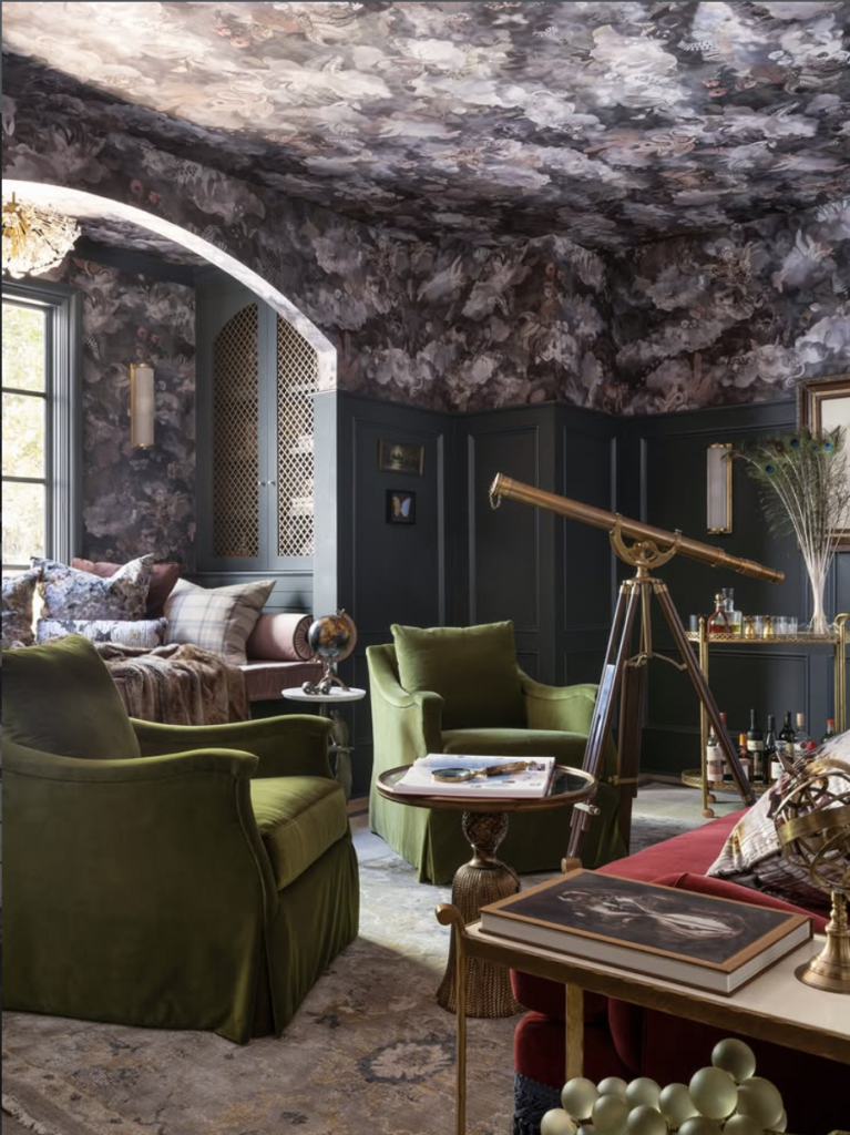
“we’re continuing to move away from cool grays and overly neutral spaces and toward colors that feel warmer and richer. I’m seeing deep earthy greens/olives, caramel and chocolate browns, burgundies, ochres, and muddier blues really moving forward,” shares designer DuVäl Reynolds of DuVäl Designs in Fairfax Virginia.
Green gets grounded
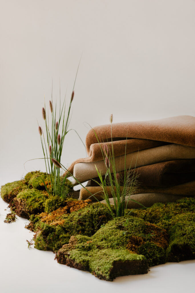
“We are seeing the continued importance of warm neutrals – think oatmeal and sand tones replacing silvery greys, and deep chocolate browns replacing charcoal. This trend extends to accent colors, where earthier tones, especially in the green family, act as grounding base layers,” shares Rosa Glenn, chief merchandising officer at Ernesta. She continued, “We’re continuing to add more variations of earthy green into our line. This color is wonderfully versatile and functions much like a navy does – a little hit of color that lives harmoniously with other neutrals. You get the depth and richness of a layered room without it registering as ‘pop.'”
Green isn’t going anywhere. But the greens moving forward aren’t necessarily the bright, fresh shades that have dominated recent trend reports.
They’re earthier. Mossier. More complex.
Rosa Glenn, chief merchandising officer at Ernesta, says warm neutrals such as oatmeal and sand are replacing silvery grays, while earthy greens are becoming grounding base layers.
And there’s a reason green has such staying power: it can behave almost like a neutral while still bringing depth and personality into a room.
York Wallcoverings‘ Gina Shaw is seeing a similar desire to reconnect with nature, pointing to moss green alongside warm wood tones and heritage-inspired furnishings.
Jennifer Hunter of Dogwood Hill sees greens and blues behaving almost like neutrals themselves, creating layered palettes rather than a room built around a single hero shade.
In other words, green isn’t the accent anymore. It may be part of the foundation.
Gina Shaw, vice president of product at York Wallcoverings had this to say, “Consumers want to reconnect with nature.” She continued, “With the return of rich, nostalgic colors like moss green…These colors are a tribute to heritage, complimenting a mixture of modern furniture and accents of vintage pieces … another emerging trend.”
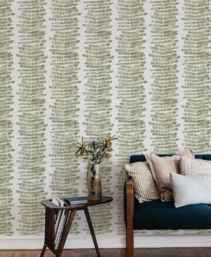
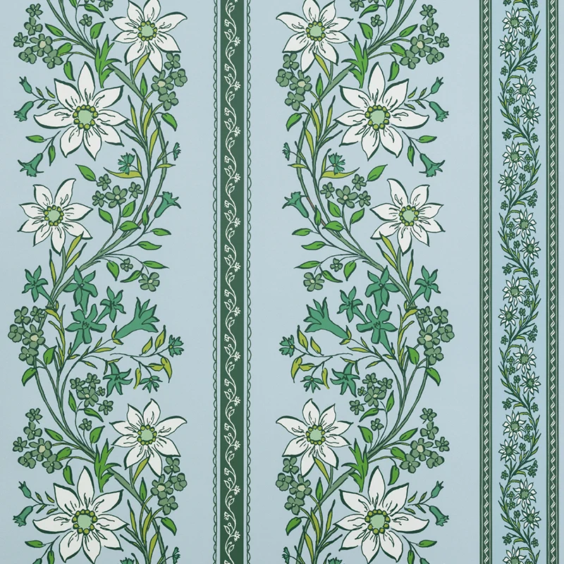
“I’m seeing color move toward shades that feel grounded, familiar and rooted in nature, like leafy greens, timeworn blues, creamy whites and warm beiges, with brighter colors layered in for a little personality. Rather than one dominant ‘color of the year,’ I think we’re moving toward layered palettes that feel collected and personal, with greens and blues almost behaving like neutrals.” Jennifer Hunter, founder and owner, Dogwood Hill
Dogwood Hill’s Chalet Chintz wallpaper in Blue and Green. Art by Holly Hollon
Blue Is Still in the Room
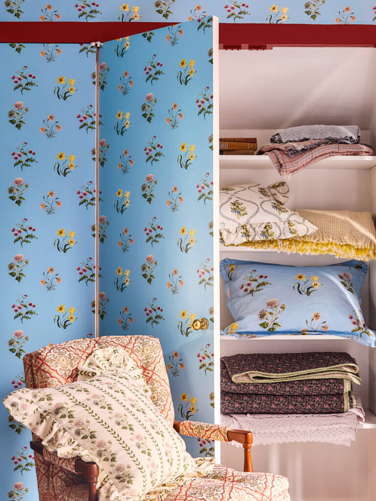
“I’m drawn to the way color can completely change the feeling of a room, and we’re seeing people become more comfortable embracing color in a bigger, more expressive way. For the… NYBG (New York Botanical Gardens) Stone Cottage Collaboration, we partnered with Little Greene Paint to bring in a beautiful range of nature-inspired shades, from soft blues and greens to deeper, more unexpected tones, that reflect the surrounding landscape.” Jaimee Seabury, vice president GreenRow.
GreenRow x NYBG Poms wallpaper was created from the Botanical Gardens’ archives. Photo: Kate S. Jordan
If there is one color that refuses to leave the conversation, it’s blue.
At Spring High Point Market, we saw it ourselves: blue wasn’t disappearing. It was getting stronger.
After years of smoky, gray-infused blues, the pendulum appears to be swinging toward shades with more clarity and saturation — navy, sapphire, indigo and those unmistakably rich blues that command attention.
Sydney Harrell, founder of DFW Textile Sourcing and Serefina Studio, says clients are gravitating toward clearer, more saturated blues, including shades reminiscent of Hermès’ Bleu Jean.
And she’s seeing them paired with brighter greens.
Leah Hook of Gray Oak Studio takes a slightly different approach, seeing navy as the perfect bridge between the warm neutrals defining today’s interiors.
“Blue isn’t going anywhere,” seems to be the consensus and it has decided it no longer needs to apologize for being blue.
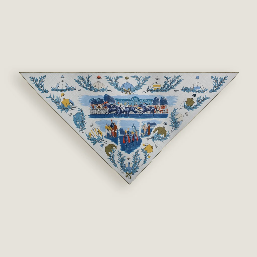
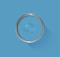
“Blue is definitely getting bolder in 2026. After several years of smoky, gray-toned shades, we’re seeing clients gravitate toward clearer, more saturated blues like Sherwin Williams Bluebird Feather, Farrow & Ball St Giles Blue, and shades reminiscent of Hermès’ Bleu Jean leather. We’re especially seeing these stronger blues paired with brighter greens, a combination that continues to come up in our custom rug requests over the past six months. Blue isn’t going anywhere, but clients are looking for stronger, more saturated versions of it.” – Sydney Harrell, founder, DFW Textile Sourcing and Serefina Studio
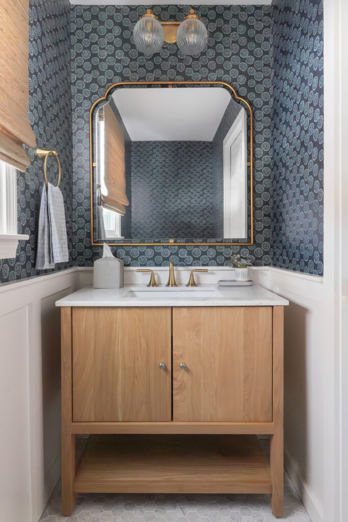
“Navy Blue – It’s a true classic that it almost feels like a neutral. It pairs perfectly with beige, cream, and taupe, which are the foundational palette of the moment. The warm-toned neutrals are beautifully balanced, becoming both classic and layered with the addition of navy.” Leah Hook, founder and principal designer, Gray Oak Studio, Lynnfield, MA
The return of red
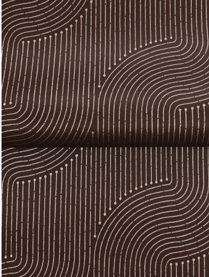
“we also see the return of vintage reds like ox blood/maroon which are warm and compliment warm wood tones in furniture and flooring,” Gina Shaw, vice president of product at York Wallcoverings
York’s Braddock Merlot Rhythmic Flow wallpaper pairs metallic gold against deep maroon.
The color story gets considerably more interesting when red enters the room.
Not candy apple red. Not fire-engine red.
Think oxblood. Burgundy. Maroon. Pomegranate.
These are the reds with history — shades that feel collected, sophisticated and especially good with warm woods and traditional forms.
York Wallcoverings is seeing the return of vintage reds as part of a broader nostalgia for heritage colors and pieces with a sense of history.
Fireclay Tile’s Jamie Chappell is also seeing significant interest in deep reds, particularly oxblood.
And the appeal isn’t simply the color itself. In materials such as glass tile, deep reds can shift dramatically as light moves across the surface, giving them a complexity that a flat paint swatch simply can’t capture.
Red is back — but it’s bringing a little patina with it.
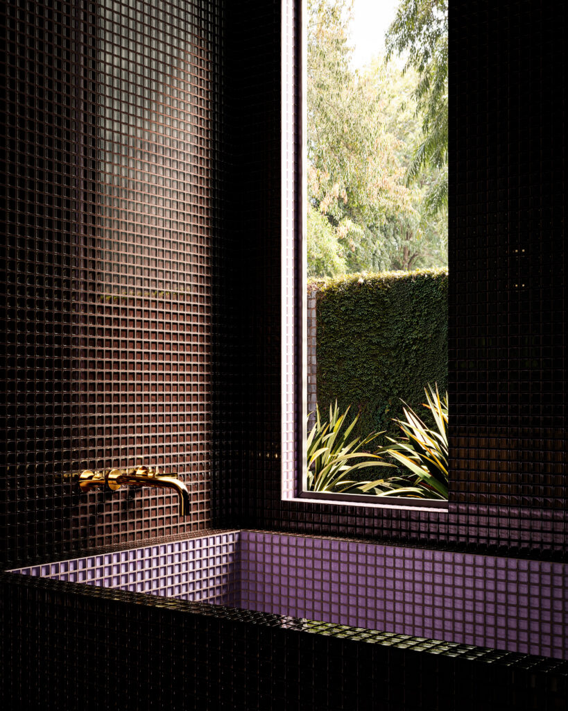
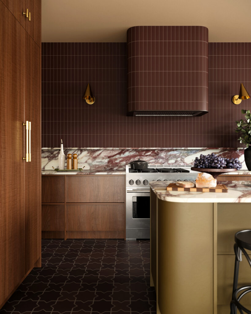
“We’re seeing a lot of interest in deep reds, especially shades like oxblood. On a material like our Nighthawk glass tile, where color is applied to the back of the tile, the surface refracts light in a way that makes the shade transform throughout the day depending on how the light is hitting it. This color is really beautiful on a kitchen backsplash, and we’re also seeing it in a lot of bathrooms surrounding the shower and tub. We love seeing it paired with a bright, unexpected color like our wisteria Waxbill.” Jamie Chappell, vice president of brand and product at Fireclay Tile.
Purple Reconsidered
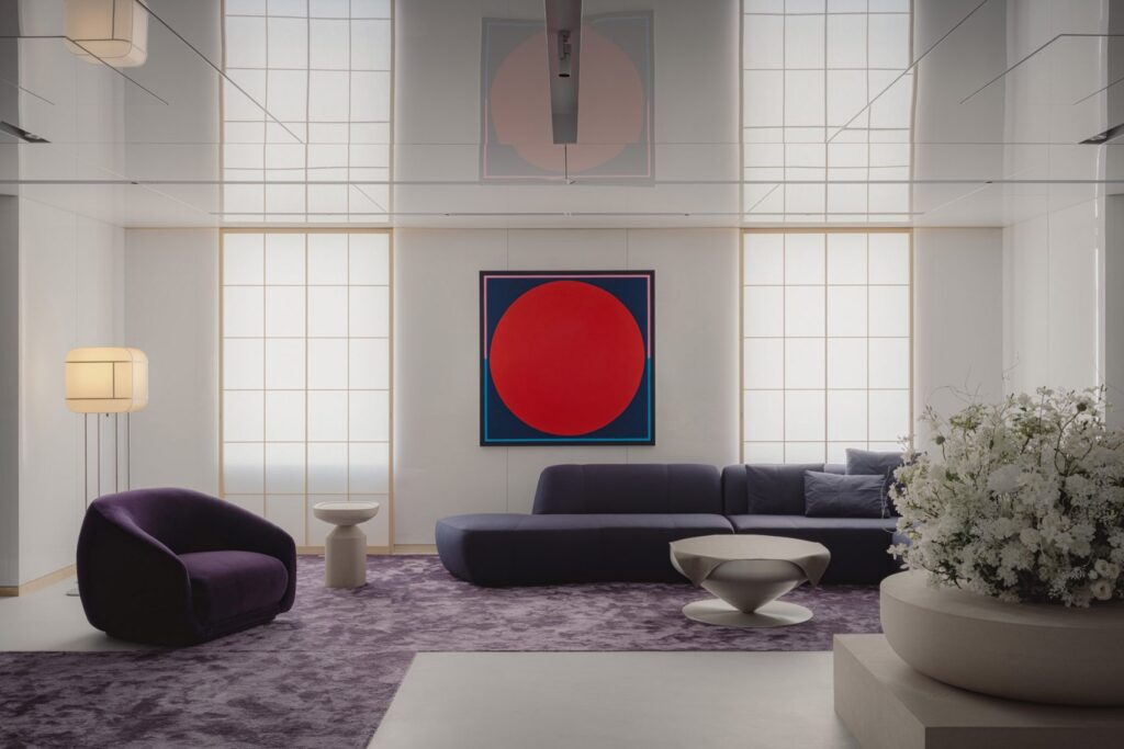
“Lavender has finally found its moment in fashion and in home accessories, but I am also betting on the emergence of “Edo Purple,” a more saturated blue-undertone violet! I’ve observed it popping up in fashion accessories and late last year in a gorgeous lounge in Tokyo’s chic Ginza neighborhood, by I IN. It is one of those in-between colors that I am very intrigued by because it is so versatile depending on how deep or saturated it is.” Noz Nozawa, Noz Design, San Francisco, CA
Purple has not exactly enjoyed a stellar reputation in interiors.
Nozawa points out that in her nearly 13 years in the industry, purple has been “interior design’s most reviled color.”
Apparently, it has had enough.
Nozawa is watching lavender make its way into fashion and home accessories while betting on the emergence of “Edo Purple” — a saturated violet with blue undertones.
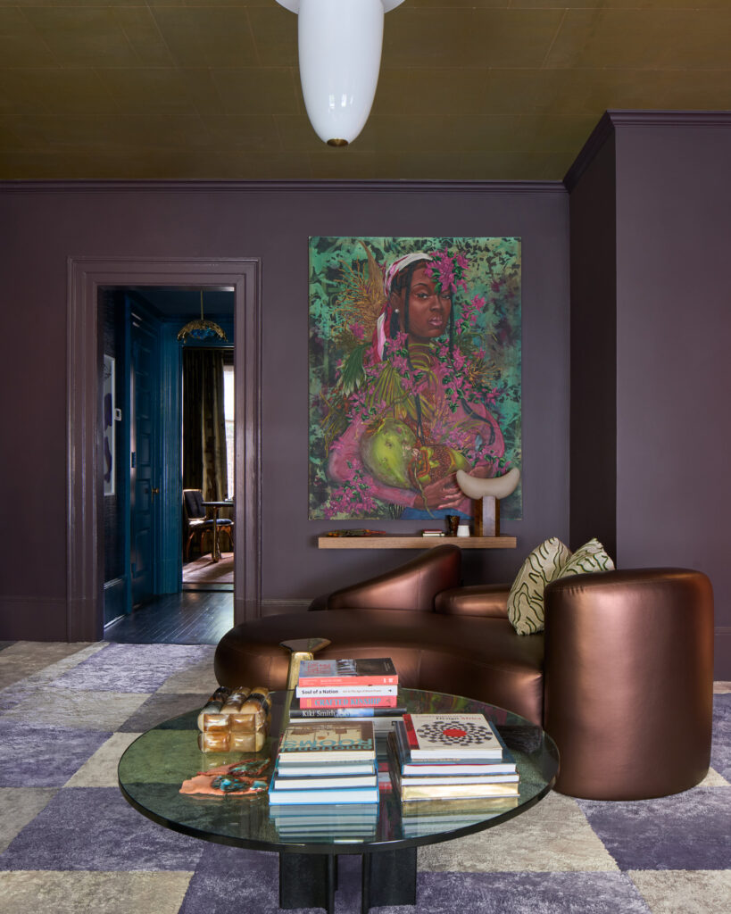
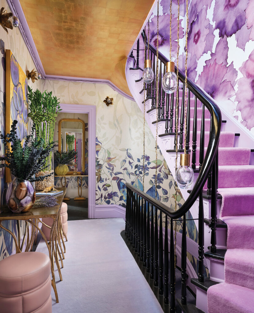
It’s a particularly compelling addition to the 2027 color conversation because purple doesn’t fit neatly into the warm-versus-cool debate.
It can be moody or playful. Romantic or dramatic. Soft or saturated.
And perhaps that’s exactly why it feels right for where design is headed.
After years of playing it safe, designers are ready to have a little fun.
The New Color of the Year Is… All of Them
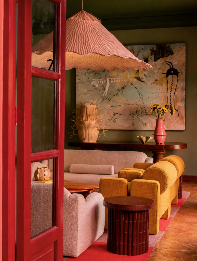
The most consistent message from our insiders isn’t about any one color. It’s about how color is being used. Designers are moving beyond the idea that a room needs a neutral foundation with a strategically placed “pop” of color. Instead, we’re seeing color-drenched rooms, saturated cabinetry, painted ceilings, wrapped upholstery, and color making its way into stone and tile, while rugs, wallpaper, art and accessories bring even more personality into the mix. Reynolds describes the shift as creating “overall atmospheres” rather than relegating color to a single wall or product — a distinction that may be the most important color story of all.
Because the real rejection of the traditional Color of the Year isn’t that designers don’t care about color trends. It’s that they’re no longer looking for one color to tell them what to do. So, what is the real color of 2027? Warmth. Depth. Saturation. Nature. Nostalgia. And a willingness to use more than one of them at once.
The insiders we spoke with aren’t describing a design world rushing toward one universal shade. They’re describing something more nuanced: palettes that feel collected, emotional and personal. And perhaps that’s the most exciting color trend of all. After years of being told what color is in, this next era of design is about choosing the colors that make a room feel like you.
And if that’s the case, we don’t need a Color of the Year after all.
Note: Header image is designed by Masar Architects, Amsterdam, Netherlands